Why Spatial Proteomics Visualization Services Matter
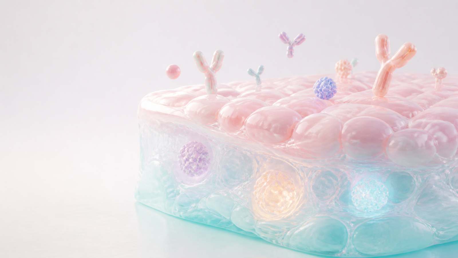
Spatial proteomics visualization services matter because multiplex protein data can be technically powerful yet difficult to understand outside the analysis team. A platform may measure dozens of immune, stromal, tumor or pathway markers while preserving tissue architecture. That is valuable for discovery, translational science and partnering, but only if the story can be read quickly by people who were not inside the assay workflow.
A strong visual translates marker abundance, neighborhood context and biological location into a clean scientific narrative. It can show where proteins appear in tissue, how cell states cluster around a lesion, why a therapeutic target sits in a useful microenvironment or how a platform connects marker panels to actionable biology. That makes spatial proteomics visuals useful for biotech websites, investor decks, BD materials, conference graphics, grant figures and manuscript-adjacent explainers.
Animiotics builds spatial proteomics visualization services around buyer comprehension. The goal is not to make a dense heatmap look prettier. The goal is to turn a high-dimensional assay into a visual system that helps a viewer understand the platform claim, remember the evidence and ask the next commercial or scientific question.
- Use spatial proteomics visuals when protein markers need tissue context.
- Design around the audience decision instead of the full data table.
- Separate raw analytical views from communication-ready figures and renders.
Start With the Marker Panel and Tissue Question
Every spatial proteomics visual should begin with the biological question. A tumor immunology team may need to show immune exclusion, checkpoint expression or target proximity. A fibrosis platform may need to explain stromal remodeling and pathway activation. A discovery group may need to compare phenotypes across tissue regions. The marker panel only becomes persuasive when it is connected to that tissue question.
This planning step prevents the common problem where every marker receives equal visual weight. If the story is about target engagement, the image should prioritize target location, relevant cell states and nearby biology. If the story is about patient stratification, the visual should make cohort-level differences easier to compare. If the story is about platform breadth, the composition should imply that the same workflow can support many indications.
For teams working across omics layers, spatial proteomics often needs to sit beside transcriptomic, cellular or clinical context. The same communication logic appears in our guide to single-cell multiomics visualization, where the visual system has to make multiple evidence streams feel connected.
- Name the biological question before assigning colors or camera angles.
- Choose primary, secondary and context markers for each figure.
- Avoid showing every marker when only a few drive the claim.
Translate Dense Assay Output Into Visual Hierarchy
Spatial proteomics can produce layers of signal that are hard to read in one view. Marker intensity, cell type calls, neighborhood structure, tissue region, pathology status and response groups can all compete for attention. Visualization services help by turning that complexity into hierarchy. The viewer should know what to look at first, what evidence supports the claim and what details are available for deeper review.
A communication-ready figure may use a simplified tissue render, a clean marker overlay, a focused cell-neighborhood view or a before-and-after comparison. It does not need to reproduce the entire analytical interface. In commercial contexts, the figure should reduce cognitive load while preserving enough scientific discipline to survive review by assay scientists, platform leads and external collaborators.
This is where static figures and 3D renders can work together. A polished render can introduce the tissue concept or marker location, while a companion figure can show the actual analytical evidence. The render creates orientation. The data view provides support. Together they let the audience move from biological intuition to proof.
- Give the most important marker or tissue region the strongest visual priority.
- Use fewer colors in communication assets than in exploratory analysis.
- Pair explanatory renders with evidence panels when technical proof matters.
| Input | Communication Job | Best Visual Treatment |
|---|---|---|
| Multiplex marker panel | Show which proteins drive the biological claim | Focused marker grouping with restrained color rules |
| Tissue region map | Orient the viewer before detail | Simplified tissue render or clean spatial crop |
| Cell neighborhood analysis | Explain proximity and microenvironment logic | Zoomed tissue neighborhood with clear cell-state grouping |
| Cohort comparison | Support stratification or response story | Matched panels with consistent scale and caption language |
Build Figures for Biotech Buyers
Biotech buyers do not all read spatial proteomics figures the same way. A pharma partner may ask whether the platform reveals target biology that changes a program decision. An investor may ask whether the assay creates defensible translational insight. A research collaborator may ask whether the figure respects the underlying tissue and marker biology. A website visitor may only ask whether the company seems credible enough to contact.
Spatial proteomics visualization services should account for those reading modes. A technical supplement can carry detailed marker lists and statistical methods. A commercial deck needs a visual claim that lands in seconds. A website section needs a polished image that makes the platform category understandable before the visitor reaches the detailed evidence. A conference graphic needs a strong silhouette and a short caption.
This buyer-aware approach is similar to the planning behind translational biomarker visualization services. In both cases, the visual has to connect assay output to a decision about mechanism, patient group, platform value or next experiment.
- Adapt the same scientific story for website, deck and review contexts.
- Use captions that state the visual claim rather than naming the assay only.
- Make the first view easy enough for a non-specialist buyer to enter.
Create a Reusable Spatial Proteomics Figure System
A reusable figure system is more valuable than a one-off spatial proteomics graphic. Once the team agrees on marker color rules, tissue-region language, cell-state icons, render style and caption patterns, new outputs can be created faster and with fewer review cycles. This matters when the company needs website visuals, investor updates, posters, BD leave-behinds and publication-adjacent figures from the same evidence base.
The system should include approved tissue motifs, marker cluster treatments, cell-neighborhood views, comparison layouts, crop rules and alt text patterns. It should also define what should never happen, such as mixing colors across markers without a legend strategy or using a beautiful render that implies a claim not supported by the assay.
A modular system lets spatial proteomics evolve with the platform. As new marker panels, indications or collaborators appear, the visual language can expand without making each new graphic feel disconnected from the previous one.
- Define marker color rules before producing campaign assets.
- Create reusable tissue, cell-state and protein-marker visual modules.
- Keep evidence figures and premium renders connected through the same style system.
Plan Deliverables for Websites Decks and Partnering
Spatial proteomics visuals should be planned for the channels where buyers will actually encounter them. A homepage hero image needs negative space, clean cropping and a fast read. A scientific page can carry a more detailed tissue story. An investor deck needs the same visual claim to survive a screen share. A BD deck may need modular panels that can be rearranged around different partner interests.
Deliverables often include a wide cover render, in-post section images, slide-ready figures, transparent assets, poster crops and compressed web versions. Planning those formats early prevents awkward cropping and avoids rebuilding the same scene for every channel. It also gives the content team consistent alt text and caption language for each asset.
For platform companies, spatial proteomics visuals can support a broader communication system that includes animation. Static tissue scenes can become storyboard frames, looped website motion or explainer video segments. That connects naturally with biotech explainer video production when a team needs to move from figure sets into motion.
- Approve desktop, mobile and slide crops before final export.
- Prepare web-optimized files separately from presentation-resolution assets.
- Use the same visual modules when static figures become animation frames.
FAQ About Spatial Proteomics Visualization Services
What are spatial proteomics visualization services?
AThey are scientific visualization services that turn multiplex protein marker data and tissue context into clear figures, renders, deck visuals, website assets and animation-ready scenes.
When should a biotech team invest in spatial proteomics visuals?
AInvest when the data supports a platform claim, target biology story, patient stratification argument, immune microenvironment insight or translational package that needs to be understood outside the analysis team.
Can spatial proteomics visuals include real assay data?
AYes. The strongest communication systems often pair polished explanatory renders with real evidence panels, assay crops or simplified quantitative views. The key is to distinguish explanatory imagery from measured data.
How many images does a launch or campaign need?
AMany teams start with one cover image plus three to five supporting section visuals. Larger launches may need a reusable library for website pages, investor decks, conference materials and future data updates.
- Use spatial proteomics visuals when tissue context is part of the claim.
- Pair beauty with scientific review so the assets remain credible.
- Build reusable modules when the platform story will keep expanding.
Ready to Build Spatial Proteomics Visuals
Spatial proteomics visualization services are most useful when they turn high-dimensional marker data into a visual story that buyers can understand quickly. The right visual can explain where the biology happens, why a marker pattern matters and how a platform turns tissue context into evidence.
Animiotics helps biotech, platform and research teams create spatial biology figures, tissue renders, marker-panel visuals, deck assets and animation-ready scenes. The work can support a launch page, investor deck, BD campaign, conference presence, publication-adjacent figure set or technical sales motion.
Talk to Animiotics about spatial proteomics visualization services
- Bring the marker panel, tissue question and target audience into the first brief.
- Use a reusable visual system for marker colors, tissue context and captions.
- Turn spatial evidence into buyer-ready assets without losing scientific discipline.