Why Single-Cell Multiomics Visualization Matters for Buyers
Single-cell multiomics visualization matters because platform teams rarely need to communicate just one layer of evidence anymore. They need to explain how transcriptomic shifts line up with chromatin accessibility, surface protein state or perturbation response in a single program story. The raw data may be convincing to computational biologists, but decision makers usually need a clearer visual hierarchy before they can understand what the platform really unlocked.
That need shows up across biotech. Discovery groups want to show why a target stands out in a heterogeneous tissue. Platform companies want to prove that their assay or analysis stack can reveal cell states that single-modality workflows miss. Translational teams want to explain which multimodal signature supports mechanism, response or patient stratification. In every case, the communication challenge is the same: the more modalities you add, the easier it becomes to lose the audience.
A strong visual system solves that problem by separating data complexity from message clarity. Instead of dumping UMAPs, heat maps and linked browser screenshots into one slide, good single-cell multiomics visualization gives each layer a role. One figure may establish the biological system. Another may show the RNA and ATAC relationship. A render or short animation may then turn that evidence into a more memorable platform story for external audiences.
- Use each modality to answer one clear question instead of letting every panel compete at once.
- Design for mixed audiences who need scientific credibility and fast comprehension.
- Treat visualization as part of platform positioning rather than a cosmetic last step.
What Clients Actually Need From Single-Cell Multiomics Visualization
Clients usually do not buy a figure because it looks modern. They buy it because it helps a dataset carry more weight in a meeting, a deck or a manuscript. In practical terms, single-cell multiomics visualization needs to show how multiple readouts connect without implying that every modality is equally informative in every cell. The Seurat WNN framework is useful context here because it formalizes a reality that visual communication teams also face: different modalities contribute different amounts of signal depending on the biological question.
This means a useful deliverable is not just a polished UMAP or a crowded summary panel. Buyers need a sequence of assets that helps them move from global orientation to local proof. That might start with a simplified tissue or platform overview, then move into cell-state separation, then narrow into a local story about enhancer accessibility, RNA expression and protein phenotype. The final asset should help the audience see what changed and why the change matters.
This is also why platform teams increasingly combine static and cinematic outputs. A paper or data room may require exact charts and careful annotation. A partner pitch may need the same logic translated into a cleaner visual metaphor. Our post on How to Choose Spatial Transcriptomics Visualization Software for Clear Tissue Atlas Stories shows the same pattern in spatial biology: the deliverable works best when evidence and explanation are intentionally staged rather than blended into one overloaded image.
- Show modality relationships without flattening them into one generic panel.
- Move from broad biological context to one high-value mechanistic claim.
- Design outputs that can scale from journal figure to partner-facing render.
Core Workflow Decisions Before You Design the Figures
The best single-cell multiomics figures are usually decided before any rendering starts. Teams need to define the audience, the biological question and the dominant modality for the story. A discovery audience may care most about regulatory state and target plausibility. A translational audience may care about response-associated cell populations. A platform audience may care about why paired RNA and ATAC measurements from the same cell create stronger evidence than a stitched integration across experiments.
Those decisions shape the visual form. If the message is assay differentiation, an architecture diagram plus one clear multimodal result may outperform a long methods panel. If the message is disease biology, you may need a progression from atlas-level overview to one sharper state transition. If the message is partner confidence, your figure set should show that the computational interpretation is grounded in an understandable biological frame rather than a black-box pipeline.
Official platform materials from 10x Genomics and current reviews in Nature make the market signal clear: multimodal workflows are now tied to target identification, biomarker discovery and translational decision making, not just exploratory omics. That is why the visual workflow must be commercially aware. A buyer evaluating single-cell multiomics visualization is really evaluating whether your team can make complex data legible enough to support action.
- Choose the lead modality for the story before deciding the layout.
- Define whether the asset is for manuscript detail platform marketing or BD communication.
- Keep the visual argument tied to a business or research decision.
Workflow Comparison for RNA ATAC and Protein Storytelling
Most groups do not need one universal figure template. They need a stack that can translate multimodal evidence into the right level of clarity for the audience. The comparison below frames the common workflow layers in those terms.
The best workflow is usually the one that preserves analytical honesty while reducing the time it takes a non-specialist to understand why the dataset matters.
| Workflow Layer | Best Use | Strengths | Likely Limits | Commercial Signal |
|---|---|---|---|---|
| Native analysis outputs from Seurat ArchR or equivalent | Internal review | High information density and direct analytical traceability | Too dense for external storytelling | Strong for expert validation |
| Curated static figure set | Papers decks and data rooms | Improves hierarchy labeling and cross-panel logic | Still requires the viewer to connect steps mentally | Best for rigorous communication |
| 3D render or abstracted platform visual | Homepage and partner decks | Turns multimodal complexity into a memorable visual system | Can drift from the data if not grounded well | Best for positioning and recall |
| Short explanatory animation | Platform launch and business development | Shows sequence dependency and modality relationships clearly | Needs stronger scripting and review | Best when the audience must understand the story quickly |
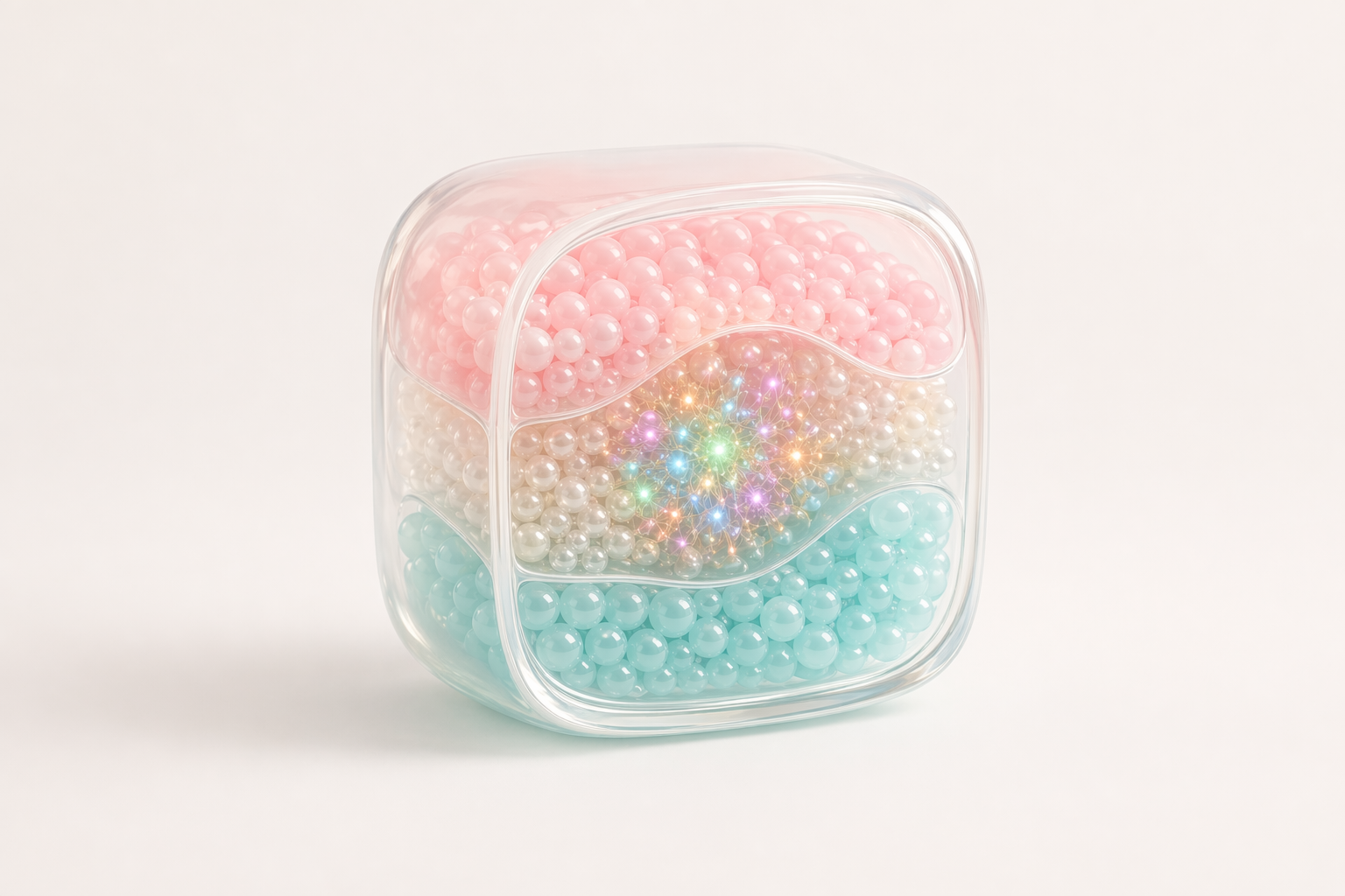
How to Visualize RNA ATAC and Protein Layers Without Clutter
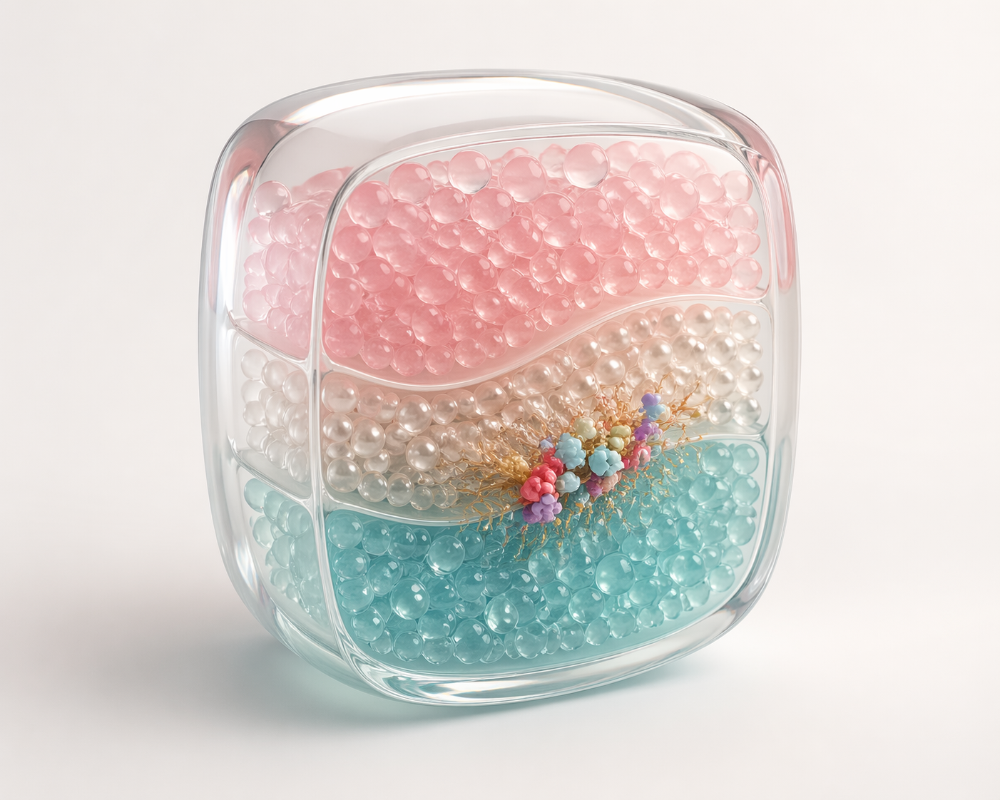
Clutter is the default failure mode in multimodal storytelling. Teams often try to prove rigor by showing every assay layer in every panel. The result is a figure that feels comprehensive but communicates very little. A better approach is to assign a single job to each panel or scene. One panel can establish cell-state structure. Another can show the accessibility program that supports that separation. A third can connect surface protein or perturbation response to the same state logic.
Color and composition matter more than teams expect. If RNA, ATAC and protein layers all use unrelated palettes and panel styles, the reader has to decode the design system before they can decode the biology. Consistent grouping, repeated orientation and restrained annotation reduce that burden. The visual goal is not to erase complexity. It is to make the complexity navigable.
This logic also carries into more stylized work. Our guide to AlphaFold 3 Complex Visualization explains a similar principle in structural biology: show one relationship at a time, keep the hierarchy stable and let the viewer build confidence step by step. Single-cell multiomics visualization succeeds for the same reason.
- Avoid asking one panel to explain assay design cluster identity and mechanism at the same time.
- Reuse orientation color families and label logic across modalities.
- Make one visual element carry the main message in each section.
When Static Figures Are Enough and When Animation Adds Value
Static figures are often enough when the audience needs to inspect exact values, marker genes or accessibility peaks. They are also better when the main task is archival communication, peer review or supplement-ready documentation. But when the story depends on order, comparison or layered interpretation, animation can reduce confusion much faster than a static figure set.
This is especially true for platform storytelling. A short sequence can show the tissue context, then reveal cell populations, then introduce paired RNA and ATAC signal, then isolate the high-value biological conclusion. That progression mirrors the way teams actually explain their data in meetings. It also gives commercial audiences a cleaner path from raw complexity to product relevance.
The key is restraint. Animation should not turn multimodal data into generic floating particles with no analytical anchor. It should clarify sequence and relationship. That is the same standard we use in our PDB to Animation workflow: motion earns its place only when the order of information changes understanding.
- Use static figures for precise reference and detailed review.
- Use animation when order and progression are part of the message.
- Keep every cinematic choice tied to one analytical claim.
FAQ About Single-Cell Multiomics Visualization
What is single-cell multiomics visualization used for?
AIt is used to explain how multiple molecular readouts from the same cells support a biological or platform claim. Teams use it for manuscripts partner decks product marketing grant figures and internal reviews.
What makes a good single-cell multiomics figure?
AA good figure establishes biological context first then introduces modality relationships in a deliberate order. It should preserve analytical credibility while reducing the cognitive load on the viewer.
How do you choose between RNA-focused and ATAC-focused storytelling?
AStart with the decision the audience needs to make. If the claim is about state identity or expression shift RNA may lead. If the claim is about regulatory logic differentiation or enhancer activity ATAC may need to lead, with RNA used as supporting context.
Can single-cell multiomics visualization help platform companies win clients?
AYes. Clear visuals make it easier to show why a platform captures more actionable biology than a single-assay workflow. They also help research and BD teams reuse the same data story across manuscripts decks landing pages and conference materials.
CTA: Turn Multiomic Data Into a Clear Platform Story
If your team has strong multimodal data but the story still feels too dense for partners investors or cross-functional stakeholders, Animiotics can help turn RNA ATAC and protein evidence into figure systems renders and short animations that communicate faster without losing scientific logic.
We work with biotech platform and research teams to translate complex datasets into visuals that are commercially useful and publication-ready. If you need single-cell multiomics visualization that supports a manuscript a launch deck or a platform narrative, see how we can help or start a project discussion.