Why Pharmacokinetic Visualization Services Matter
Pharmacokinetic visualization services turn exposure logic into scientific visuals that buyers can understand quickly. A founder, platform lead, BD team or translational scientist may know the ADME story in detail, yet the audience often sees only disconnected curves, tables and assay notes. The communication problem is not a lack of data. It is that absorption, distribution, metabolism, excretion, tissue exposure, sampling windows and dose rationale are usually spread across multiple slides with no clear visual hierarchy.
For biotech teams, pharmacokinetic visualization is commercially important because PK data often decides whether a platform story feels credible. A molecule can have a promising mechanism, strong potency and a polished target rationale, but investors and partners still ask whether enough drug reaches the right compartment for long enough. Clear PK visuals help answer that question without forcing the audience to decode every graph on their own.
A strong visual system shows where the therapeutic starts, how it moves through the body, what barriers shape exposure and why the selected dose supports the intended biology. That story can live in an investor deck, scientific animation, conference presentation, website hero, publication figure or internal program review. The goal is not to decorate the data. The goal is to make exposure evidence feel connected to mechanism, indication and platform value.
The Buyer Problem: PK Data Is Often Clear To Scientists But Not To Decision Makers
PK teams usually work with rich evidence: plasma concentration curves, tissue distribution, metabolite profiles, half-life estimates, dose proportionality, clearance, assay sensitivity and exposure response assumptions. Those details are necessary for development, but they can overwhelm non-specialist decision makers. A partner may only need to know whether the exposure window covers the biological window. An investor may need to know why the dose is feasible. A platform customer may need to see why the delivery system changes tissue access.
This is where pharmacokinetic visualization services create leverage. The right figure can separate primary evidence from supporting evidence. It can show the main route through the body, spotlight the relevant compartment and make the exposure timeline readable. It can also clarify what is measured directly, what is modeled and what is inferred from translational evidence.
The best visuals do not flatten uncertainty. They make uncertainty easier to discuss. A clean PK visual can show observed data, modeled projections and decision thresholds in a way that preserves scientific honesty. That is especially useful for teams working across discovery, preclinical development, clinical translation and platform business development.
- Show the exposure window before showing every assay detail.
- Link concentration, tissue access and mechanism in one visual path.
- Separate measured evidence from projected or modeled evidence.
- Use visual hierarchy so dose rationale is readable in seconds.
What To Include In A Pharmacokinetic Visual Story
A practical PK story usually needs four layers. The first layer is route and compartment: oral, intravenous, subcutaneous, local delivery, systemic circulation, target tissue, intracellular space or a protected anatomical site. The second layer is time: absorption, peak exposure, distribution, clearance, target engagement window and repeat dosing logic. The third layer is evidence: concentration-time curves, tissue measurements, bioanalytical assay confidence and exposure response markers. The fourth layer is business meaning: why this PK profile supports the product, platform or study design.
The visual should be built around the strongest buyer question. For a delivery platform, the question may be tissue access. For a long-acting biologic, it may be half-life and dosing interval. For an oncology payload, it may be tumor exposure versus systemic exposure. For a CNS program, it may be barrier crossing and target compartment concentration. For a platform company, it may be repeatable design logic across candidates.
A good creative process starts by choosing the primary visual claim. If the claim is longer exposure, the hero should be a timeline or circulating molecule with a clear persistence cue. If the claim is selective tissue exposure, the hero should be the target compartment. If the claim is dose feasibility, the hero should connect dose, exposure and biological threshold. Visuals work best when every object supports that claim.
| PK question | Best visual subject | Commercial message |
|---|---|---|
| Where does the drug go? | Target tissue, vascular route and compartment boundary | The platform reaches the biology that matters. |
| How long does exposure last? | Time curve, depot release or circulation scene | The dose supports a practical treatment window. |
| What evidence supports the model? | Bioanalytical sample, assay readout and measured concentration | The story is grounded in data rather than visual guesswork. |
| Why is the profile valuable? | Mechanism linked to exposure threshold | PK supports differentiation, not just development housekeeping. |
ADME Animation Services For Platform And Program Stories
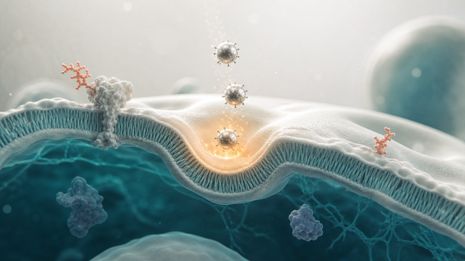
ADME animation services are useful when static charts cannot explain the sequence of events. Absorption, distribution, metabolism and excretion are inherently spatial and temporal. A molecule moves from administration site to plasma, across membranes, into tissue, through metabolic pathways and eventually toward clearance. Animation can show those transitions while keeping the audience oriented.
For platform companies, ADME visuals should avoid generic body diagrams. The important question is what makes the platform different. A prodrug company may need to show enzymatic activation in a specific compartment. A nanoparticle team may need to explain circulation, endosomal escape and clearance differences. A biologics company may need to show FcRn recycling, target-mediated drug disposition or tissue penetration. A small molecule company may need to explain metabolite exposure, selectivity and safety margin.
The same principles connect to adjacent Animiotics topics like https://animiotics.com/blog/receptor-occupancy-visualization-services-how-to-explain-target-engagement-dose-selection-and-platform-value-clearly/ and https://animiotics.com/blog/preclinical-pharmacology-animation-services-how-to-explain-dose-response-biodistribution-safety-and-translational-value-clearly/. PK visuals become strongest when they link exposure to target engagement, pharmacology and translational decision making rather than treating concentration curves as isolated technical artifacts.
- Use route-of-administration scenes only when route shapes the value story.
- Show barriers and compartments as physical design constraints.
- Keep the ADME sequence simple enough for a deck audience.
- Reserve detailed pathway steps for scientific meetings and appendix figures.
How To Visualize Exposure Response Without Overselling Certainty
Exposure response visualization is most useful when it respects the difference between correlation, mechanistic interpretation and decision thresholds. A clean visual can show observed concentration, biomarker movement and efficacy or safety readouts without pretending that every relationship is fully proven. That distinction matters in biotech communication because sophisticated buyers look for rigor, not just polish.
The safest approach is to design around evidence tiers. Direct measurements should look concrete. Model projections can use softer material, translucent volumes or clearly separated visual zones. Translational assumptions can be framed as rationale rather than fact. This helps teams discuss why a dose was selected, why a time point matters and why a biomarker supports a next experiment.
For a pitch deck, the exposure response visual may be a single concise figure that links dose to target tissue concentration and downstream biomarker change. For a scientific animation, it may become a sequence: administration, distribution, local exposure, target engagement and response. For a publication or poster, it may be a graphical abstract that shows the measured pathway without replacing the quantitative plots.
Design Rules For Biotech PK Figures And 3D Renders
Biotech PK figures should be designed for scanning. The audience should identify the molecule class, route, compartment, timing and value claim before reading the caption. That means the visual system needs clear silhouettes, restrained color, consistent scale cues and limited supporting forms. When a PK figure becomes a busy collage of organs, arrows, curves, icons and labels, the audience stops trusting the hierarchy.
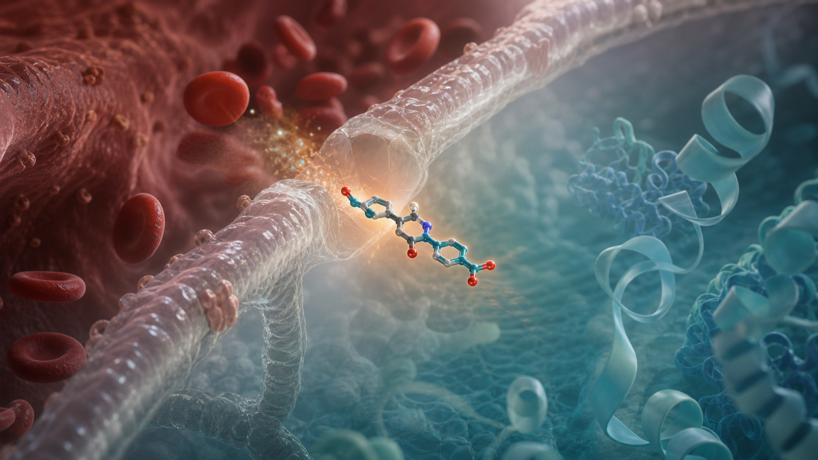
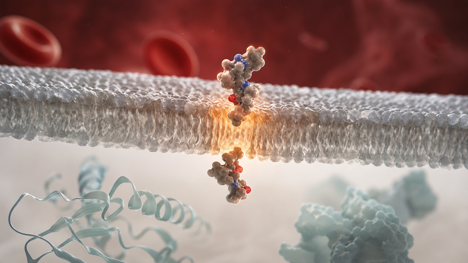
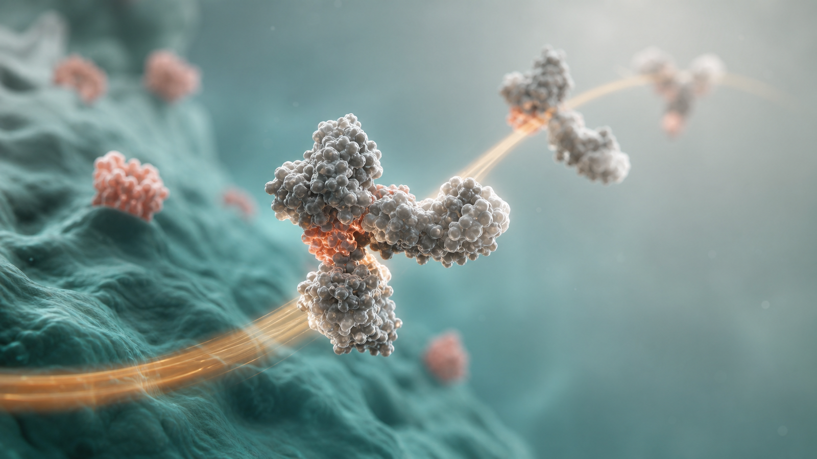
3D scientific renders can make pharmacokinetic stories feel more tangible, especially for delivery, tissue access, membrane crossing, receptor binding and intracellular exposure. The key is restraint. One hero subject should carry the scene: a therapeutic molecule passing through a membrane, a depot releasing payload, a protein drug persisting in circulation or a target tissue volume receiving drug. Supporting elements should be few and purposeful.
The same buyer-facing discipline applies to animation. Motion should clarify causality. Camera moves should show compartments and transitions. Materials should signal biology without turning the scene into toy-like shapes. A premium Blender or Maya style can make a PK story feel sophisticated while preserving scientific credibility.
- Use one central subject per visual instead of a collage.
- Make timing visible through spacing, motion or repeated exposure states.
- Use color to separate route, tissue and therapeutic class.
- Avoid fake dashboards, decorative labels and overloaded arrow systems.
Where Pharmacokinetic Visualization Creates Commercial Value
Pharmacokinetic visualization services are not only for regulatory or clinical teams. They also support business development, fundraising, platform marketing, sales enablement and scientific recruiting. A BD deck may use PK visuals to explain why a delivery platform unlocks a hard-to-reach tissue. A fundraising deck may use them to defend dose feasibility. A website page may use a render to show that the company understands more than target biology. A conference booth video may use a short sequence to make platform differentiation memorable.
Commercial value often comes from reducing explanation time. If a partner needs fifteen minutes to understand why the exposure profile matters, the meeting loses momentum. If the same logic is visible in one figure and one short animation sequence, the discussion can move to deal fit, indication strategy, study design and next steps.
This is especially important for platform companies that must tell a repeatable story across multiple assets. A consistent PK visual language lets the team show candidate-specific details while keeping the platform logic recognizable. That consistency can make every new program feel like proof of a broader engine.
FAQ: Pharmacokinetic Visualization Services
What are pharmacokinetic visualization services?
APharmacokinetic visualization services create scientific figures, 3D renders and animation sequences that explain how a therapeutic is absorbed, distributed, metabolized, cleared and connected to dose or response. They are used in biotech decks, scientific presentations, websites, publications and partner-facing materials.
Do PK visuals replace concentration-time plots?
ANo. Quantitative plots remain essential. PK visualization makes those plots easier to interpret by showing route, compartment, mechanism and value context. The strongest materials usually combine clean data graphics with a spatial or mechanistic visual that explains why the numbers matter.
Can Animiotics visualize modeled PK data?
AYes, but modeled data should be presented with appropriate visual language. Observed measurements, model projections and assumptions should be distinguishable so the communication stays credible. This is important for translational pharmacology, dose projection, exposure response and early platform stories.
What inputs are needed to start?
AUseful inputs include the therapeutic class, route of administration, target tissue, core PK claims, available plots, measured endpoints, desired audience and the intended asset format. A rough slide, manuscript figure or internal diagram is enough to begin shaping the visual story.
Ready To Turn PK Evidence Into Buyer-Ready Visuals
If your team needs to explain ADME, exposure, dose rationale, biodistribution or platform pharmacology, Animiotics can help turn the evidence into clear scientific visuals. We build buyer-ready figures, premium 3D renders and scientific animation systems for biotech, pharma, research and platform teams that need complex biology to become understandable fast.
Use pharmacokinetic visualization services when your current slides make the data feel fragmented, when a partner keeps asking how exposure supports the mechanism or when your platform needs a visual language that can scale across programs. See related work at https://animiotics.com/blog/drug-discovery-animation-services-how-to-explain-targets-screening-mechanisms-and-platform-value-clearly/ or start from the Animiotics homepage at Animiotics.
- Build a single PK hero figure for a pitch or partner deck.
- Create a 3D render system for route, tissue and exposure stories.
- Turn ADME logic into a short scientific animation sequence.
- Translate platform pharmacology into visuals that commercial audiences can use.