Why Bioinformatics Platform Visualization Services Matter
Bioinformatics platform visualization services help computational biology, AI biology, omics and translational research teams explain value that often lives behind code, pipelines and data models. A buyer may understand that a platform analyzes sequencing data or ranks targets, but that does not mean they can see why the workflow is differentiated, where the biological evidence enters or how the output supports a decision.
That gap matters in biotech sales, partnering and investor conversations. Platform teams are usually asking the audience to trust an engine that combines data ingestion, quality control, feature extraction, model inference, biological interpretation and experimental prioritization. If those steps appear as a dense methods slide, the story can feel abstract. If the visual makes the evidence flow visible, the same platform can feel more concrete, testable and commercially useful. Clear visuals also help technical founders repeat the same story consistently across discovery calls, conference booths and partner reviews.
Animiotics builds premium 3D scientific renders and animation systems for teams that need to turn computational biology into clear visual communication. The goal is not to decorate a software story with generic particles. The goal is to show the relationship between algorithms, biological inputs, evidence layers and decisions so biotech, pharma and research clients can understand the platform faster.
- Make the biological input visible before explaining the model.
- Connect algorithmic steps to target, biomarker or patient evidence.
- Use one coherent visual language across website, deck and scientific materials.
Start With The Platform Buyer Question
A useful visualization starts with the buyer question. A pharma partner may ask how the platform finds targets that competitors miss. An investor may ask how data access, model design and validation create a durable advantage. A scientific collaborator may ask whether the workflow preserves biological context instead of forcing messy data into an oversimplified score. Each question needs a different visual hierarchy.
For a target discovery platform, the first scene should usually show how molecular, genomic or cellular evidence is organized around a target decision. For a biomarker platform, the visual may need to show assay inputs, patient stratification logic and translational evidence. For an AI biology platform, the strongest visual may be a bridge from protein, RNA or cell context into model-guided prioritization without showing fake dashboards or unreadable interface elements.
This topic connects naturally to Animiotics guidance on https://animiotics.com/blog/ai-drug-discovery-visualization-services-how-to-explain-models-targets-assays-and-platform-value-clearly/ and https://animiotics.com/blog/single-cell-multiomics-visualization-how-to-turn-rna-atac-and-protein-data-into-clear-platform-stories/. Bioinformatics platform visualization services sit between those needs because the buyer must understand both the data workflow and the biological claim.
- Define the decision the viewer should trust after the visual.
- Choose one platform advantage for the hero scene.
- Separate data processing steps from biological interpretation.
What To Visualize In A Bioinformatics Platform Story
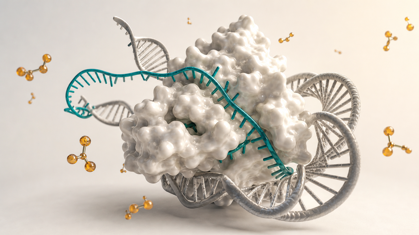
Most bioinformatics platform stories need three layers. The first layer is biological input: sequencing reads, protein structures, microscopy patterns, cell states, assay signals or clinical metadata. The second layer is computational transformation: alignment, normalization, feature extraction, model inference, ranking or clustering. The third layer is decision output: target selection, patient segmentation, biomarker confidence, mechanism hypothesis or experiment priority.
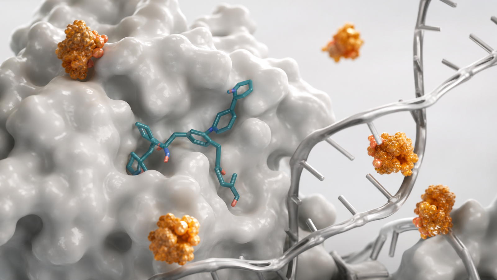
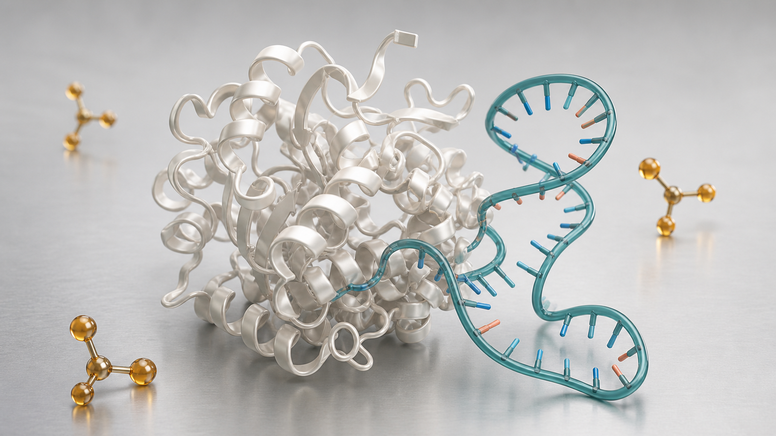
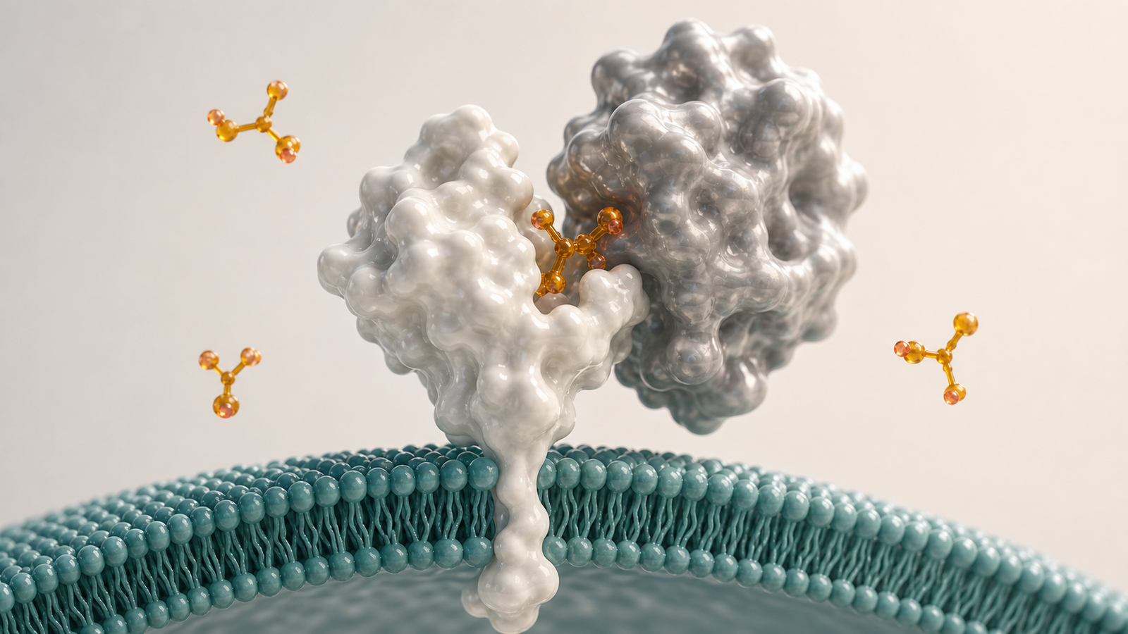
The visual challenge is that only one of those layers is inherently visible. Code and algorithms do not have a natural physical form. That is why strong platform visuals use biological objects as the anchor and represent computation through movement, hierarchy and evidence flow rather than fake UI panels. A protein surface, RNA strand, cell membrane or tissue niche can carry the scientific context while controlled molecular markers show selection, confidence or prioritization.
A polished sequence might begin with a clean molecular or cellular scene, move through a restrained evidence pathway and end on a clear biological decision. The audience should never feel as if they are watching generic data magic. They should see what enters the system, what changes as the workflow runs and what claim the platform can support when the result is reviewed.
For platform teams with multiple use cases, this visual grammar can become a reusable asset system. The same core objects can support target discovery, biomarker analysis, indication expansion, mechanism validation or partner-specific proof points. That consistency helps the company look disciplined while still allowing each story to focus on a different commercial question.
- Show biological input as a real scientific subject, not an abstract icon.
- Represent computation through structured motion and evidence flow.
- End each visual sequence on a decision that matters to the buyer.
Useful Deliverables For Computational Biology Teams
Bioinformatics teams usually need a small system of assets rather than a single illustration. A website hero needs one high-trust render that makes the platform feel scientific and premium within seconds. A pitch deck needs a sequence that explains why the workflow is more than a black box. A BD deck may need modular views for target discovery, biomarker ranking, patient stratification and experimental validation.
The best deliverables are reusable. A protein or RNA scene can become the visual base for target discovery. A membrane or cell-state scene can support biomarker interpretation. A sparse evidence-marker language can help explain ranking, confidence or model output without turning the asset into a chart. When the visual system is planned well, new platform modules can be added without redesigning the entire story.
The table below maps common communication needs to useful visual assets for bioinformatics, omics and AI biology platforms.
| Need | Best visual asset | Why it works |
|---|---|---|
| Explain target discovery | Protein, RNA or pathway evidence render | Connects algorithmic ranking to a biological object buyers recognize |
| Show model value | Short evidence-flow animation | Makes the transformation from input data to decision visible |
| Clarify biomarker logic | Cell or membrane scene with restrained molecular signals | Links assay evidence to patient or mechanism context |
| Support platform sales | Reusable visual system across use cases | Keeps the story consistent across website, pitch and partner materials |
How To Keep Data Platform Visuals Scientific And Buyer-Ready
Bioinformatics visuals fail when they become generic technology art. Floating grids, glowing dashboards, code walls and abstract network clouds can make a platform look less specific rather than more advanced. Scientific buyers want to know what biology is being analyzed, why the method is credible and how the result changes a research or business decision.
A buyer-ready style should feel precise, restrained and biologically anchored. Premium 3D molecular surfaces, protein ribbons, RNA strands, cell membranes and microscopy-inspired volumes can make computation feel connected to real science. Muted teal, pearl white, silver gray and warm amber give enough contrast for readability without slipping into candy colors or toy-like visuals.
The same restraint should apply to motion. Animation can show how evidence moves through the workflow, but it should not overwhelm the viewer with every technical detail. The strongest scenes usually isolate one mechanism moment, one evidence transition or one platform decision. That focus helps a non-specialist buyer follow the story while giving scientific reviewers a credible map for deeper discussion.
Captions and alt text should also stay concrete. Instead of saying that an image shows innovation, describe the visible molecular scene and the platform point it supports. That improves accessibility, search visibility and reuse across product pages, conference decks, investor updates and partner follow-ups.
- Avoid fake UI, charts, labels and decorative data clouds.
- Anchor every platform visual in protein, RNA, cell or tissue biology.
- Keep one clear hero subject in each render.
FAQ About Bioinformatics Platform Visualization Services
What should a bioinformatics platform animation include?
AA useful animation usually includes the biological input, the computational transformation and the decision output. Depending on the platform, that may mean sequencing data, protein context, biomarker evidence, model ranking, target prioritization or validation workflow.
Can a computational workflow be shown without fake dashboards?
AYes. Many of the clearest platform visuals avoid interface screens entirely. They use biological subjects, controlled motion and evidence markers to show how the workflow changes the scientific interpretation.
How long should a platform animation be?
AFor a website hero or sales page, a short loop of 10 to 25 seconds can be enough. For a pitch or partner meeting, a 45 to 90 second sequence can explain the workflow if each scene answers a specific buyer question.
Is this different from scientific data visualization?
AYes. Scientific data visualization often focuses on charts, plots or analysis outputs. Bioinformatics platform visualization for marketing and BD focuses on the narrative link between data, model, biology and decision so mixed audiences can understand platform value.
Ready To Build Bioinformatics Platform Visuals That Buyers Understand
Bioinformatics platform visualization services are most valuable when they turn invisible workflow value into a clear biological story. The right visual system can help a computational biology team explain data inputs, algorithmic logic, target confidence, biomarker context and platform extensibility without forcing buyers to decode a dense methods slide.
Animiotics creates premium 3D scientific renders and animation systems for biotech, pharma, platform and research teams that need complex science to feel clear, credible and commercially useful. For related mechanism planning, see https://animiotics.com/blog/mechanism-of-action-animation-services-how-biotech-teams-explain-complex-biology-clearly/.
If your platform story needs to work on a website, in a pitch deck or in a partner meeting, start with Animiotics and turn the workflow into a visual sequence buyers can understand.
- Build a reusable visual grammar for data, model and biology.
- Use premium 3D renders to make abstract workflows concrete.
- Make the first scene clear enough for a non-specialist buyer.