Why Flow Cytometry Visualization Services Matter
Flow cytometry visualization services help biotech, pharma and research teams explain cell evidence without making buyers decode dense plots on their own. Flow cytometry is powerful because it can show phenotype, function, abundance, activation state and assay response across complex cell populations. The problem is that the raw visual language was built for expert analysis, not for fast commercial understanding.
A buyer, investor or cross-functional partner may see a gating tree, scatter plot or marker panel and understand that data exists. That is different from understanding what the data proves. A clear visual system can turn gating logic into a guided story: which cells matter, which markers define them, which biological shift supports the product and why the result changes the decision.
For Animiotics clients, flow cytometry visuals often sit between data communication and premium scientific rendering. The goal is not to decorate a plot. The goal is to make the assay evidence feel credible, inspectable and connected to mechanism, platform value or translational use.
The Buyer Problem: Gating Logic Hides The Biological Point
Most flow cytometry stories start too late. A slide shows a final percentage or marker shift, then asks the audience to trust a small gating panel buried nearby. Technical viewers may understand the sequence, but commercial audiences often miss the chain of reasoning. They see dots, quadrants and acronyms before they see the biological claim.
A buyer-ready flow cytometry figure or animation should make the hierarchy obvious. First, show the sample or cell context. Second, show how the relevant cell population is isolated. Third, show the marker pattern or functional response. Fourth, connect that evidence to the platform claim, therapeutic mechanism or assay decision.
This is especially important for immunology, cell therapy, oncology, inflammation, assay services and translational biomarker teams. These teams need to explain why a marker panel matters without turning every buyer conversation into a methods tutorial.
- Use gating strategy visualization to show the reasoning behind the result.
- Keep the visual focus on the cell population that drives the claim.
- Separate assay logic from commercial value so both are easier to follow.
- Avoid using raw plots as the only explanation of platform evidence.
What A Strong Flow Cytometry Visual Should Show
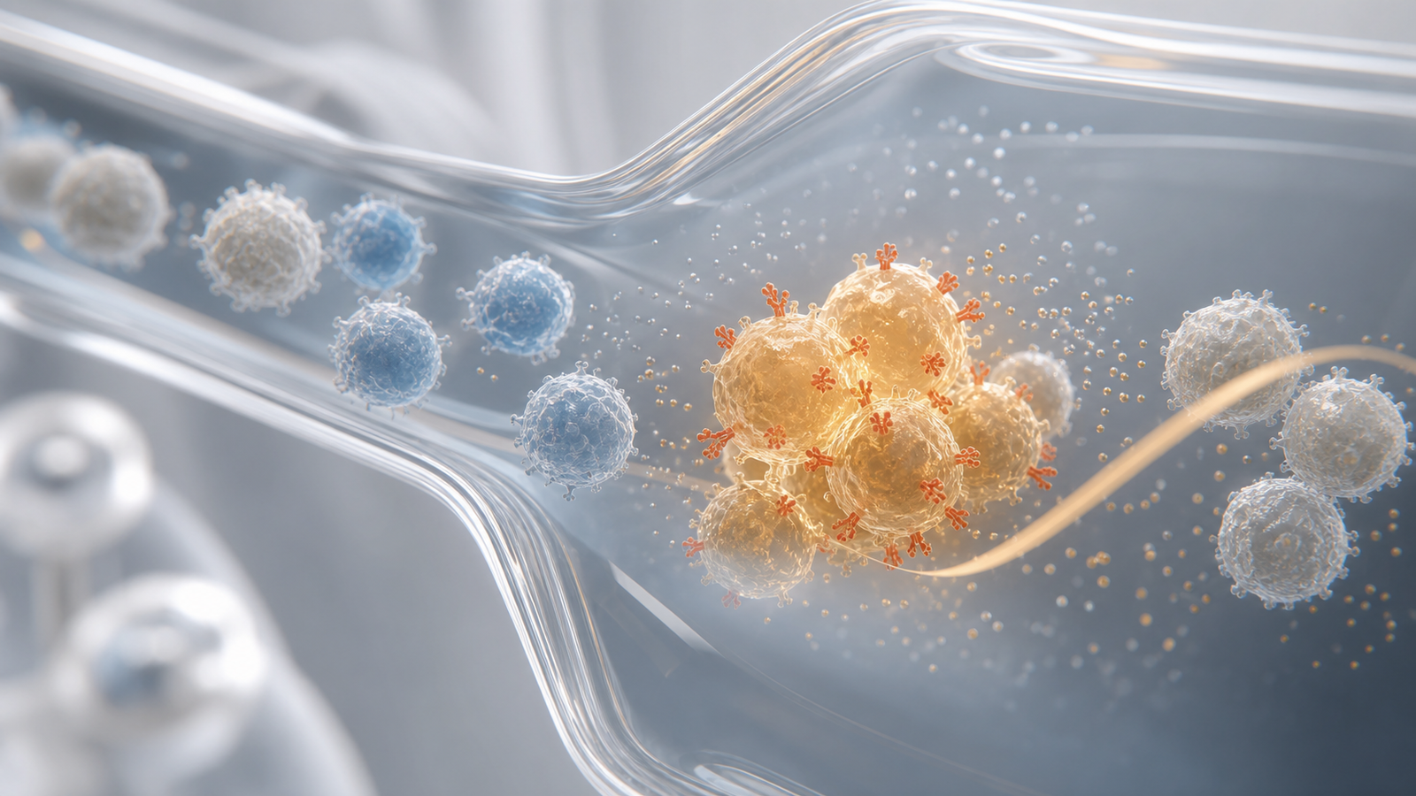
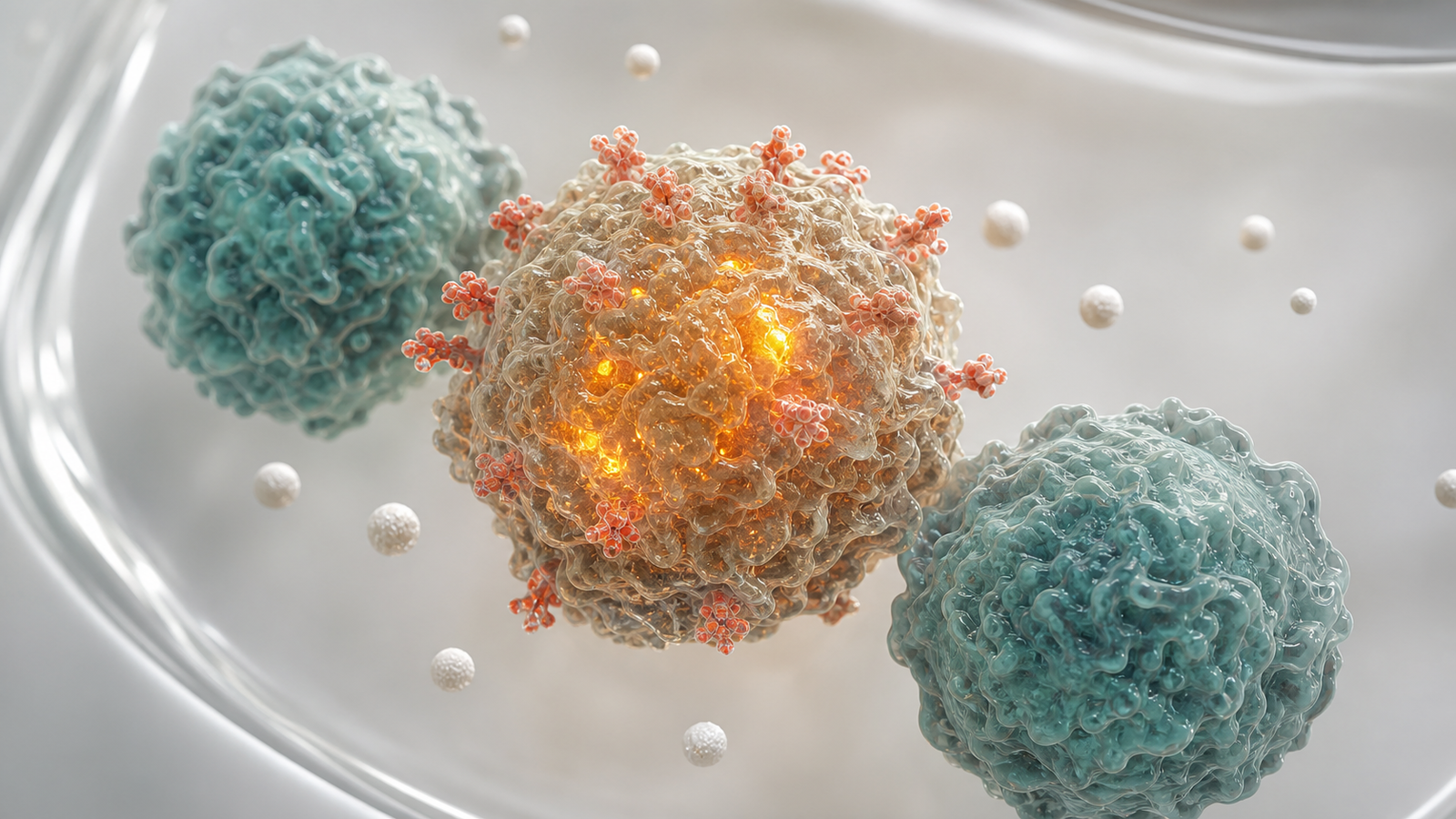
A strong flow cytometry visual has a clear scientific subject. That subject may be an immune cell subset, a receptor-positive cell population, an activated phenotype, a cytotoxic response, a cytokine-producing group or a sample-level shift after treatment. The subject should be visible before the audience reads a caption.
The supporting elements should stay disciplined. A few marker-coded cells, a simplified gating path, a membrane receptor, an intracellular signal or a clean assay volume can create enough context. Too many plots, arrows and panels can make the asset feel like a crowded poster instead of a premium scientific render.
Related Animiotics resources such as https://animiotics.com/blog/companion-diagnostic-visualization-services-how-to-explain-assays-biomarkers-patient-selection-and-clinical-utility-clearly/ and https://animiotics.com/blog/translational-biomarker-visualization-services-how-to-turn-assays-mechanisms-and-clinical-signals-into-clear-scientific-stories/ show how assay visuals can connect technical evidence to patient selection, biomarker strategy and buyer-facing communication.
| Visual layer | Scientific job | Commercial job |
|---|---|---|
| Cell population | Show the phenotype, activation state or responder subset | Make the result concrete at first glance. |
| Gating path | Clarify how the final cell group was isolated | Build confidence in the evidence chain. |
| Marker pattern | Show receptor, cytokine, viability or functional signal | Explain why the assay supports the claim. |
| Platform context | Connect cells, assay logic and biological outcome | Help buyers remember what the technology changes. |
Flow Cytometry Animation Versus Static Gating Figures
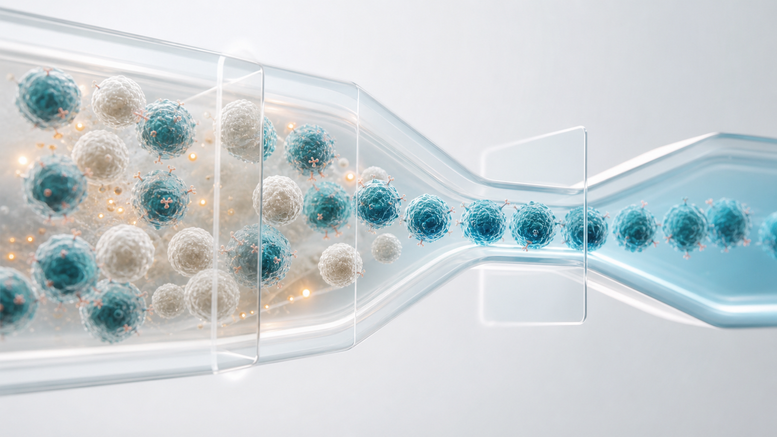
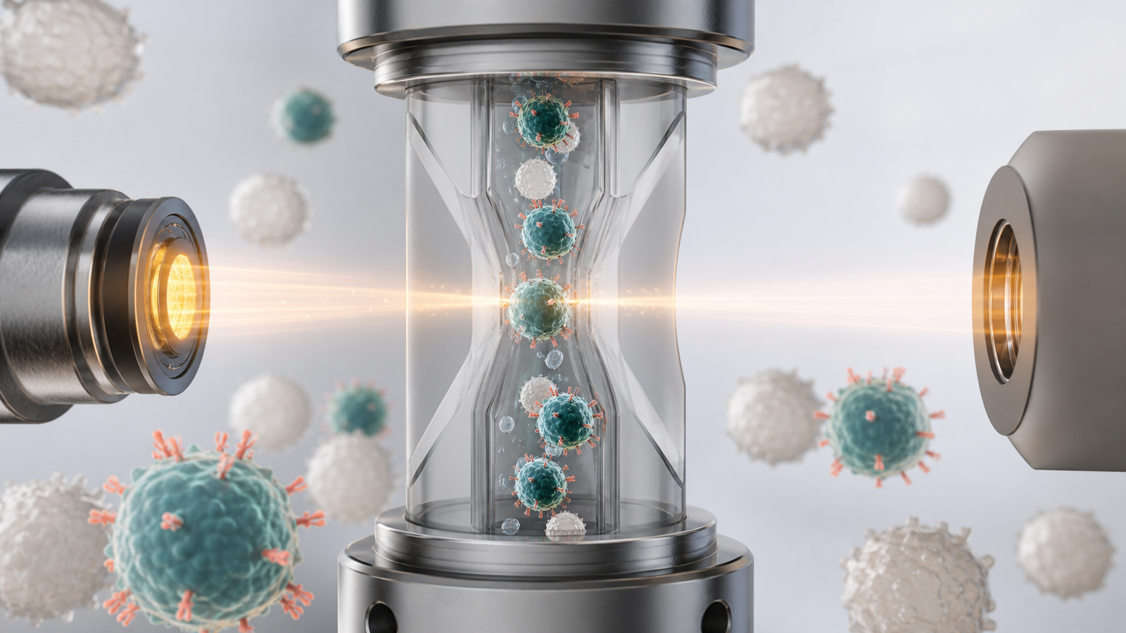
Static gating figures are useful for methods sections, posters and technical review. They are less effective when the audience needs to understand the logic quickly. Flow cytometry animation can show the same reasoning as a sequence. A sample becomes a population, the population separates into meaningful subsets, then the key phenotype or functional response becomes the hero.
This does not mean every project needs a long explainer video. A short loop or motion sequence can be enough for a product page, conference booth, investor deck or webinar. Motion is useful when the order matters: sample preparation, exclusion gates, marker selection, phenotype emergence and treatment response.
The best animation avoids fake UI and avoids overpromising precision. It can use stylized cell volumes, translucent gates, marker-coded membranes and a simplified data cloud while still keeping the scientific claim grounded. The result should feel like a clear visual translation of assay logic rather than a decorative tech animation.
- Use animation when gating order or phenotype emergence is the main story.
- Use static renders when the campaign needs a memorable assay evidence image.
- Use a mixed system when the same science must support web, deck and social formats.
- Keep the visual claim aligned with the underlying assay evidence.
Where Flow Cytometry Visuals Create The Most Value
Flow cytometry visuals create the most value when the data supports a buying decision but the raw plots are too dense for the audience. Examples include cell therapy phenotype release, immune activation assays, tumor immune profiling, cytokine response studies, receptor occupancy assays, companion diagnostic workflows, potency assays and translational biomarker packages.
A platform company may need to show why its marker panel reveals a meaningful immune state. A therapeutic team may need to show how treatment shifts a responder population. A service provider may need to show assay rigor without overwhelming a product page. A research group may need to turn a complex panel into a publication figure or grant visual that reviewers can parse quickly.
Flow cytometry visualization also works well when paired with broader mechanism assets. For example, a cell therapy story can show engineered cells in a tissue context, then use flow cytometry visuals to support identity, potency or activation claims. An assay platform story can show the sample workflow, then zoom into the cell population that carries the decisive signal.
Visual Direction For Premium Flow Cytometry Renders
Premium flow cytometry renders should feel mature, scientific and controlled. The scene should usually include one clear cellular or assay hero subject: a focused immune cell population, a central gated population, a receptor-marked cell surface or a clean sample stream with cells separating by phenotype. Supporting forms should be sparse and readable.
A restrained biotech palette keeps the image credible. Muted teal blue, pearl white, silver gray, warm amber and small coral accents can separate cell types, marker signals and assay energy without turning the visual into a candy-colored collage. Physically plausible materials, soft studio lighting, subtle depth of field and a light neutral background help the subject feel premium.
The image should not rely on text, labels, fake interface panels, charts or dashboards. Flow cytometry is already plot-heavy, so the hero visual should simplify rather than add clutter. Clear silhouettes, careful marker color and a strong cellular focal point are more useful than a wall of dots.
- Favor cell membranes, receptor markers, assay volumes and microscopy-inspired depth.
- Show one biological result rather than every marker in the panel.
- Use subtle data-cloud geometry only when it helps explain gating logic.
- Avoid pastel capsules, toy-like cells, glass bead clusters, labels and watermarks.
How To Scope A Flow Cytometry Visualization Project
A flow cytometry visualization project should start with the decision the visual needs to support. Is the asset meant to explain a platform, support a product launch, clarify assay services, communicate translational evidence or improve a technical deck? The answer determines whether the final deliverable should be a static render, figure set, short animation or reusable campaign system.
Next, define the assay story. The team should identify the sample context, cell population, marker panel, gating sequence, comparison condition, endpoint and claim. That information lets the visual team decide which details need to be scientifically explicit and which can be simplified for clarity.
Useful inputs include gating plots, marker lists, representative assay results, phenotype definitions, sample preparation notes, target audience, existing brand constraints and examples of visuals the team wants to avoid. Animiotics can then build a visual system that respects the assay while making the evidence easier to understand in web pages, sales decks, grant figures, papers and investor materials.
FAQ: Flow Cytometry Visualization Services
What are flow cytometry visualization services?
AFlow cytometry visualization services turn gating strategies, cell phenotypes, marker panels and assay results into clear scientific figures, renders and animation assets for biotech, pharma and research communication.
Can a visual simplify gating without misrepresenting the data?
AYes. A good visual keeps the sequence and claim faithful while simplifying the graphical language. It should clarify how the final population was identified, not replace technical plots where those plots are required.
Who needs flow cytometry animation?
ATeams working on immunology, cell therapy, oncology, inflammation, diagnostics, assay platforms and translational biomarkers often benefit when cell evidence has to support a buyer, reviewer, partner or investor conversation.
What should we provide before starting?
AUseful inputs include representative plots, marker panels, phenotype definitions, sample context, desired claim, audience, channel requirements and any brand or scientific constraints.
Ready To Turn Flow Cytometry Evidence Into Buyer Ready Visuals
If your flow cytometry evidence is important but hard to explain quickly, Animiotics can help turn the gating logic, cell phenotype and assay value into a polished visual system. We build premium scientific renders, mechanism visuals and short animation sequences for biotech, pharma, platform and research teams that need complex cell data to feel clear.
Use flow cytometry visualization services when your product page needs a better assay hero, your sales deck needs a clearer marker story or your research team needs figures that connect data to biological meaning. See related scientific rendering guidance at https://animiotics.com/blog/biotech-3d-rendering-services-how-to-turn-platform-science-into-buyer-ready-visual-assets/ or start from the Animiotics homepage at Animiotics.
- Create a premium cellular assay hero render.
- Turn gating strategy into a clear visual sequence.
- Build deck-ready figures for phenotype and functional response claims.
- Develop reusable web, pitch and conference visuals from one assay story.