Why a PROTAC mechanism of action animation needs a different visual strategy
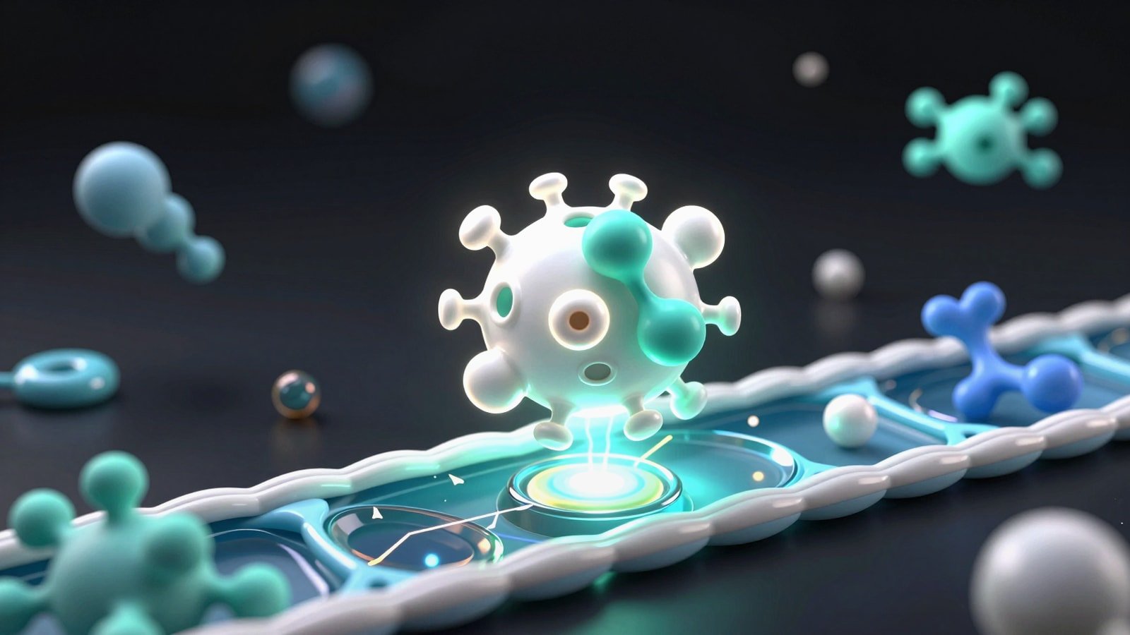
A strong PROTAC mechanism of action animation has to explain more than simple binding. In a classic inhibitor story the drug occupies one pocket and blocks one function. In targeted protein degradation the visual logic is event driven. The degrader first recruits a protein of interest and an E3 ligase into a productive ternary complex. That proximity enables ubiquitin transfer. Polyubiquitination then marks the target for proteasomal degradation. After that the degrader may disengage and potentially act again. If your animation treats PROTACs like ordinary occupancy based inhibitors the audience misses the central mechanism.
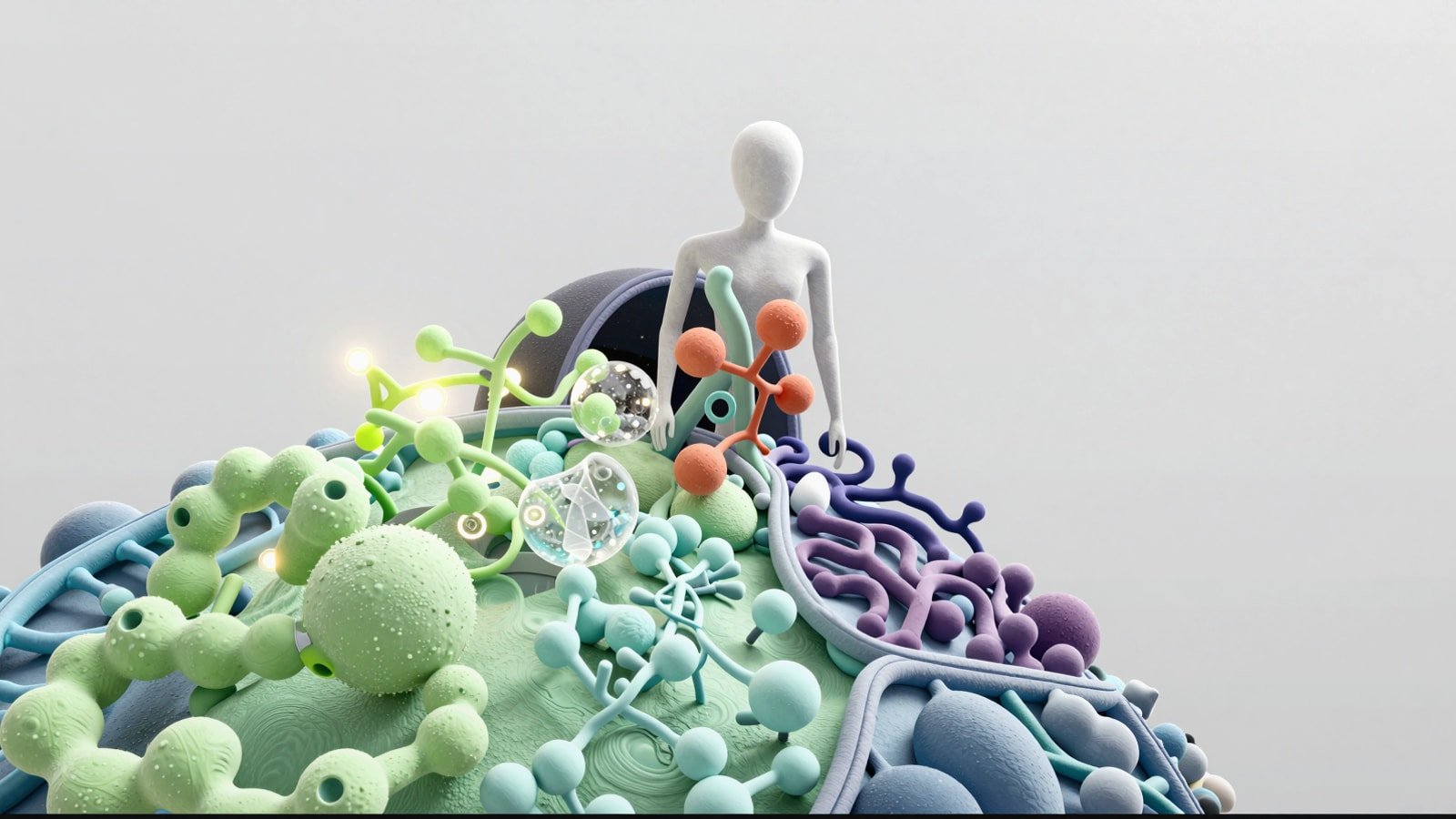
This is why a targeted protein degradation animation benefits from deliberate pacing and scene hierarchy. Viewers need to understand who the players are before they can process why the ternary complex matters. They also need visual cues that distinguish transient recruitment from permanent binding. That usually means separate color systems for the target protein, the E3 ligase, the PROTAC linker architecture, ubiquitin tags and the proteasome. When these layers are introduced in the right order the science becomes intuitive rather than dense.
The communication stakes are high. Investors want to see why degradation may outperform inhibition. Scientists want to know whether the geometry looks plausible. Clinical and commercial teams need one clean story they can repeat. A polished PROTAC visualization gives each audience a shared mental model. It can also serve as the basis for a protein degrader figure, a congress slide and a narrated web explainer without rebuilding the concept from scratch.
- Lead with the event chain rather than the chemistry alone
- Show proximity induced ubiquitination as the key turning point
- Make degradation feel catalytic rather than one molecule to one molecule
- Design for reuse across animation, static figure and presentation
The core biological sequence your animation should show
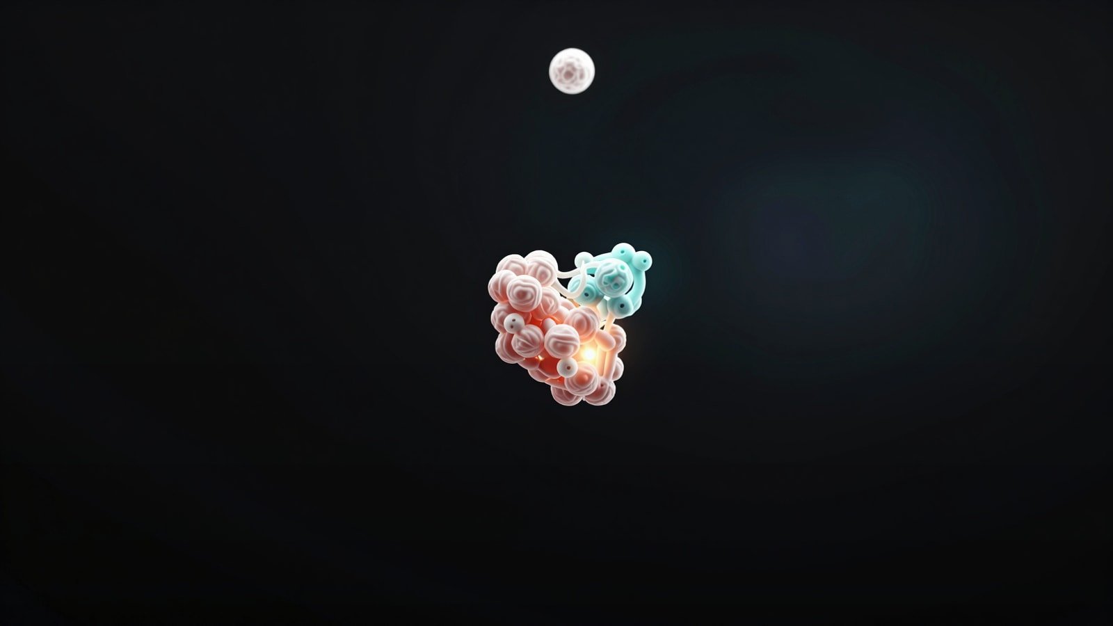
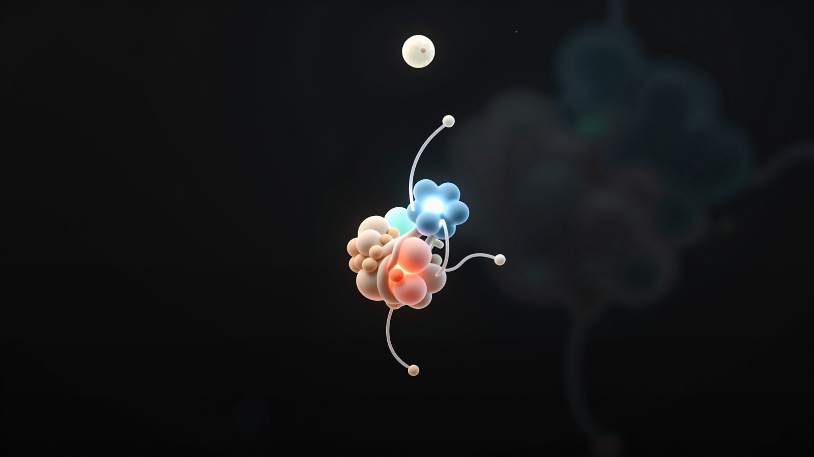
The simplest useful sequence has five beats. First establish the disease relevant target protein in its native context. Second introduce the bifunctional degrader and label its two recognition ends plus the linker. Third show target engagement and E3 ligase recruitment until the ternary complex forms. Fourth depict ubiquitin transfer in a readable stepwise or accelerated loop. Fifth show recognition by the proteasome followed by target breakdown while the degrader is released or remains available for another cycle depending on the framing you choose.
That sequence aligns with the foundational PROTAC literature and later reviews that describe degradation as a proximity driven use of the ubiquitin proteasome system. The important visual point is that the PROTAC is not the endpoint. The endpoint is selective removal of the target protein from the system. That is the moment the animation must land with maximum clarity. If the viewer remembers only one scene it should be the transition from ternary complex to ubiquitinated target to proteasomal clearance.
It also helps to decide what level of biological detail your audience can absorb. For a broad biotech audience you may show an archetypal E3 ligase and a stylized chain of ubiquitin. For a specialist audience you can specify ligases such as CRBN or VHL when the program requires it. The same rule applies to target context. Some stories work best with a domain level protein view. Others need membrane topology, nuclear localization or a disease pathway inset. The script should match the scientific decision the audience needs to make.
- Beat 1: establish the target protein and disease context
- Beat 2: reveal the bifunctional degrader architecture
- Beat 3: form the ternary complex with readable spatial logic
- Beat 4: attach ubiquitin in a clear progression
- Beat 5: deliver proteasomal degradation as the biological payoff
| Scene | What the viewer should learn |
|---|---|
| Target setup | Which protein is being removed and why it matters |
| PROTAC arrival | The molecule has two binding functions connected by a linker |
| Ternary complex | Recruitment of an E3 ligase is the decisive event |
| Ubiquitination | The target gains a degradation signal |
| Proteasome | The system eliminates the target rather than merely inhibiting it |
What to show visually in a targeted protein degradation animation
A targeted protein degradation animation works best when structure and motion carry the explanation together. Start with simple shape language. Many teams over render the chemistry and under design the choreography. You do not need every atom on screen all the time. You need the right level of structural abstraction at each moment. A clean ribbon or surface view can establish the target. A simplified E3 ligase silhouette can keep focus on recruitment. The linker can become a directional design element that literally guides the eye from one binding event to the next.
Motion is where PROTAC visualization often succeeds or fails. Random diffusion is scientifically familiar but visually muddy when overused. Instead animate toward productive encounters. Let the first contact be tentative. Let the ternary complex lock in with a subtle conformational snap or camera settle. Then shift tempo for ubiquitin transfer so the audience feels a mechanistic handoff. Finally use a distinct movement signature for proteasomal entry such as pull in, gate open and target fragmentation or fade through. Each motion language should mean something.
Static deliverables matter too. A protein degrader figure distilled from the animation should preserve the same sequence logic in one glance. One panel can show the bifunctional molecule. The next can show ternary complex formation. The next can show ubiquitination and degradation. If you build your motion system with figure extraction in mind you reduce production waste and strengthen consistency across channels.
- Use abstraction levels that fit the message of each scene
- Reserve detailed chemical views for moments of real explanatory value
- Assign distinct motion signatures to recruitment, ubiquitination and degradation
- Design every animation scene so it can collapse into a publication style figure
How a PROTAC visualization differs from a molecular glue animation
A molecular glue animation and a PROTAC mechanism of action animation both live within targeted protein degradation yet they should not look identical. A PROTAC is typically presented as a bifunctional molecule with two binding heads and a linker. A molecular glue is usually monovalent and works by stabilizing or inducing a protein protein interaction that would otherwise be weak or absent. In visual terms that means the PROTAC story often begins with architecture while the glue story begins with interface remodeling.
This distinction matters because audiences often collapse all degraders into one vague category. If your program compares modalities you should show the difference directly. In a PROTAC visualization the degrader physically bridges two partners. In a molecular glue animation the small molecule changes the interaction landscape so the target and ligase can associate productively. That makes molecular glue narratives feel more like induced fit or interfacial stabilization while PROTAC narratives feel more like guided recruitment.
When you need both in one communication system consistency still matters. Use the same base color for the target protein across assets. Use one family of ubiquitin and proteasome symbols. Then let modality specific graphics do the teaching. This side by side logic is useful when creating portfolio material, investor decks or educational blog content. For example our posts on <a href="https://animiotics.com/blog/bispecific-antibody-mechanism-of-action-animation-how-to-explain-dual-target-biology-without-losing-the-plot/">bispecific/ antibody mechanism of action animation</a> and <a href="https://animiotics.com/blog/car-t-mechanism-of-action-animation-how-to-visualize-car-t-cell-therapy-clearly/">CAR-T/ mechanism of action animation</a> show the same principle: similar proximity stories still need distinct visual grammar.
- PROTACs usually emphasize bifunctional architecture and bridging
- Molecular glues usually emphasize interfacial stabilization
- Keep shared degradation symbols consistent across modalities
- Use modality specific motion language to avoid conceptual blur
| Feature | PROTAC visualization | Molecular glue animation |
|---|---|---|
| Molecule design | Two ligands plus linker | Usually one small molecule |
| Opening visual | Bridge between target and ligase | Interface stabilization or induced fit |
| Key teaching point | Recruitment by bifunctional proximity | Creation or strengthening of a productive interaction |
| Common risk | Overcomplicated linker chemistry | Underexplained mechanism specificity |
Common mistakes that make degrader animations hard to follow
The most common failure is trying to show everything at once. Full atomistic detail, pathway context, subtitles, labels and kinetic behavior in one frame usually produces confusion. Strip the scene down to the decision relevant elements. If the goal is to explain ternary complex formation then the viewer does not need six secondary proteins in the background. If the goal is to explain selectivity then the viewer does need a brief comparison with off target proteins or nonproductive encounters. Scope should follow the message.
Another mistake is underexplaining the transition from binding to degradation. Many animations show a beautiful ternary complex and then jump straight to a disappearing target. That skips the causal bridge. Ubiquitin tagging is not decorative. It is the reason the proteasome reads the target as disposable. Even a stylized depiction of ubiquitin chain growth can dramatically improve comprehension. The same is true for catalytic framing. If the degrader is shown as consumed the viewer may assume the mechanism is stoichiometric rather than event driven.
A third mistake is failing to align the animation with downstream figure needs. Teams often commission motion first and scramble later to build conference slides, grant panels or publication graphics. A better approach is to storyboard the animation like a figure sequence from day one. That method also supports related deliverables such as <a href="https://animiotics.com/blog/graphical-abstract-maker-how-to-create-clear-publication-ready-visual-summaries-faster/">graphical/ abstracts</a>, <a href="https://animiotics.com/blog/nih-grant-figures-how-to-design-clear-visuals-for-stronger-applications/">NIH/ grant figures</a> and accessible annotation systems described in our guide to <a href="https://animiotics.com/blog/scientific-figure-accessibility-alt-text-a-practical-guide-for-journal-ready-figures/">scientific/ figure accessibility and alt text</a>.
- Do not overload the frame with unnecessary structural detail
- Do not skip ubiquitination between ternary complex and degradation
- Do not imply the degrader is always consumed
- Do not separate motion planning from figure planning
A practical storyboard for your protein degrader figure and animation
A reliable storyboard starts with a poster frame. Show the target protein alone in context with one sentence of disease relevance. Then cut to the degrader architecture with callouts for target binder, linker and E3 ligase binder. The next frame should be the most carefully composed shot in the piece: ternary complex formation. Use camera angle, contrast and spatial spacing to make the bridge legible in less than two seconds. That is the frame most likely to be reused in pitch decks and review slides.
After the ternary complex frame move into ubiquitination with an explicit temporal signal. You can stage this as sequential ubiquitin additions or as a short accelerated loop after the first tag lands. Then transition into proteasomal recognition and target removal. End with the biological consequence. That may be pathway shutdown, transcriptional change, restored sensitivity to therapy or a cleaner comparative frame versus inhibition. Without the consequence scene the animation explains mechanism but not value.
For production teams this storyboard also creates a clean approval workflow. Scientists can validate protein identity, ligand representation and ligase choice early. Brand and marketing teams can review typography, narration and CTA placement later. If structural assets come from AlphaFold, ChimeraX or custom modeling pipelines the same storyboard still holds. We use similar sequence discipline when building comparison heavy pieces such as <a href="https://animiotics.com/blog/boltz-1-vs-alphafold-3-visualization-how-to-compare-confidence-ligands-and-complex-stories-clearly/">Boltz-1/ vs AlphaFold 3 visualization</a>, <a href="https://animiotics.com/blog/alphafold-3-complex-visualization-how-to-turn-predictions-into-clear-protein-dna-rna-and-ligand-stories/">AlphaFold/ 3 complex visualization</a> and our <a href="https://animiotics.com/blog/chimerax-animation-tutorial-how-to-build-clear-protein-movies-with-scenes-and-movie-maker/">ChimeraX/ animation tutorial</a>.
- Poster frame: target protein and disease context
- Architecture frame: bifunctional degrader with readable labels
- Hero frame: ternary complex formation
- Mechanism frame: ubiquitination
- Outcome frame: proteasomal degradation and biological effect
FAQ
What is the most important scene in a PROTAC mechanism of action animation?
AThe ternary complex scene is usually the anchor because it explains why a bifunctional degrader is different from a conventional inhibitor. If that frame is unclear the rest of the mechanism loses coherence.
Should a targeted protein degradation animation show exact atomic interactions?
AOnly when those interactions drive a decision the audience needs to make. For many commercial or educational uses domain level structure plus selective close ups are more effective than constant atomic detail.
How do you explain a PROTAC visualization to non specialists?
AUse a simple sentence first: the molecule brings a disease protein to the cell's disposal machinery. Then show recruitment, tagging and removal in three visually distinct beats.
When should you compare PROTACs with molecular glue animation in the same asset?
ADo it when your audience needs modality differentiation, platform positioning or mechanism selection clarity. Keep shared symbols consistent but make the small molecule logic visibly different.
Can one animation also support a protein degrader figure?
AYes. If the storyboard is built in modular panels each scene can be exported into a figure, slide or web graphic without redesigning the whole communication system.
- Prioritize clarity of ternary complex formation over decorative motion
- Use atomic detail selectively rather than continuously
- Translate the mechanism into one plain language sentence before adding nuance
- Build modular scenes so one asset supports many downstream deliverables
CTA
If you need a PROTAC mechanism of action animation that is scientifically rigorous and commercially clear Animiotics can turn your degrader story into animation, stills and presentation ready assets built around one coherent visual system. We help teams define the mechanism, choose the right level of structural detail and shape a narrative that works for researchers, partners and investors.
See examples of our approach on the <a href="/">homepage</a> or start a conversation through <a href="/">our contact path</a> if you want to scope a targeted protein degradation animation, a molecular glue animation or a protein degrader figure for publication and business development.