How to Create a 3D Graphical Abstract for Nature and Cell (2026 Guide)
The graphical abstract used to be a nice-to-have. In 2026, it is a requirement for high-impact publishing.
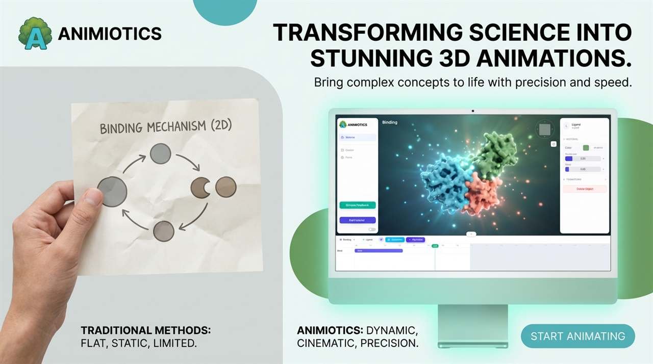
Top-tier journals like Nature, Cell, and Science prioritize papers that communicate findings visually. A compelling 3D visual increases click-through rates, social shares, and citations.
Most researchers still use 2D tools to represent complex 3D biology. The result is often a flat, crowded diagram that fails to capture depth.
This guide shows how to build a 3D graphical abstract that meets journal standards in under 20 minutes without advanced design training.
Why 3D Wins with Editors
Editors are looking for novelty. When most submissions use similar flat icons, custom 3D visualization stands out immediately.
For a related workflow, see https://animiotics.com/blog/how-to-animate-a-lipid-bilayer-in-5-minutes-without-blender/
- Spatial accuracy: 2D diagrams often misrepresent how proteins fit together. 3D reveals steric hindrance and binding pockets.
- Engagement: on a journal homepage, a 3D-rendered thumbnail attracts attention better than a line drawing.
- Multi-purpose: once you build a 3D scene for your paper, you can repurpose it for conference talks and social media clips.
Step-by-Step: From Data to Design
This workflow uses Animiotics because lighting and rendering are handled automatically, but the principles apply to any 3D tool.
Step 1: Define the Hero Object
A graphical abstract needs one focal point. Do not try to show the entire pathway in one frame.
- Bad: showing 15 kinases, the nucleus, and the mitochondria all at once.
- Good: zooming in on the single receptor-ligand interaction that drives the mechanism.
- Action: import your main protein structure (PDB) and center it as the hero.
Step 2: Establish Context (The Environment)
Proteins do not float in a void. They exist in crowded environments.
- Membrane context: if your protein is transmembrane, add a curved lipid bilayer to show orientation.
- Cytosol context: add blurred background proteins to create depth and photographic feel.
Step 3: Use Color to Guide the Eye
Journal guidelines typically expect color to indicate function, not decoration.
- Active elements: use warm saturated colors (red, orange, magenta) for molecules driving action.
- Passive elements: use cool desaturated colors (gray, pale blue) for background structures.
- Glow: apply subtle emissive intensity to the ligand so it pops against darker context.
Step 4: Annotation and Labels
This is where many 3D figures fail: floating 2D text inside 3D space can look cluttered.
- Render first: export the image without text.
- Post-production: add crisp labels in Illustrator, PowerPoint, or Animiotics 2D overlay mode.
- Flow: use numbered steps (1, 2, 3) to guide the viewer's eye from left to right.
Technical Checklist for Submission
Before uploading to a journal portal, verify technical requirements.
- Resolution: minimum 300 DPI (commonly 1200 px wide).
- Format: TIFF or EPS, with high-quality PNG increasingly accepted.
- Font: Arial or Helvetica (sans-serif).
- Aspect ratio: commonly landscape (about 2:1) or square (1:1), depending on journal rules.
2D vs 3D: A Visual Comparison
For a deeper comparison, see https://animiotics.com/blog/best-biorender-alternatives-for-3d-science-animation-2026/
| Feature | 2D Diagram (BioRender) | 3D Visualization (Animiotics) |
|---|---|---|
| Depth | Flat or layered | True depth with shadows |
| Rotation | Impossible | Infinite angles |
| Realism | Schematic or cartoon | Photorealistic |
| Impact | Standard or expected | High and novel |
Summary
You spent years generating the data. Do not let a flat figure hide the discovery.
Moving to 3D makes your graphical abstract both more visually compelling and more scientifically accurate.
Ready to design your cover art?
(Works in Chrome and Edge)