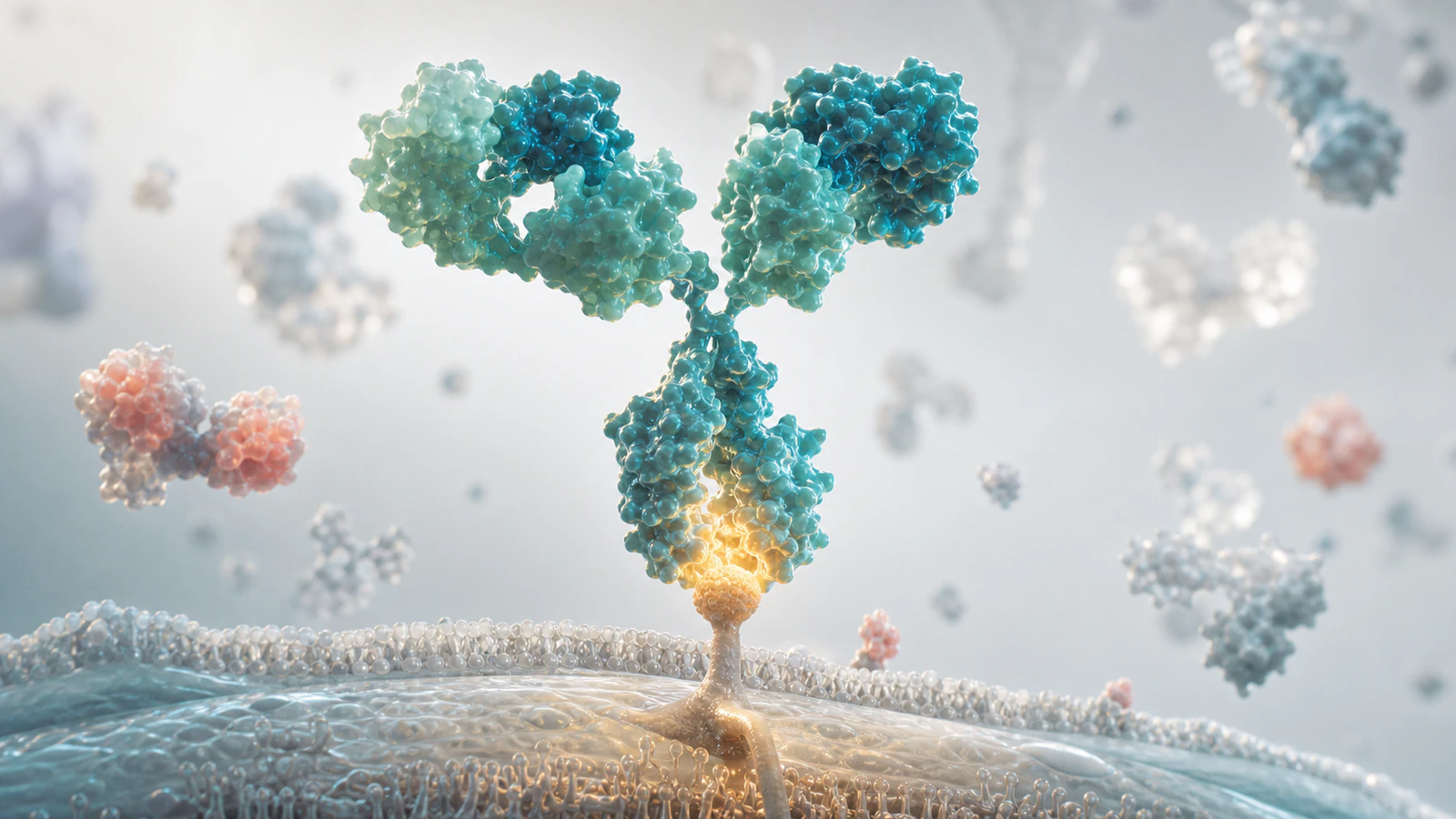
Why Bioanalytical Assay Stories Need Better Visuals
Bioanalytical assay visualization services turn invisible measurement logic into a story that scientific, clinical, regulatory and commercial teams can explain with confidence. PK curves, PD biomarkers, immunogenicity screens, ligand binding assays, mass spectrometry readouts and translational sample workflows all shape whether a program feels credible. Yet those same details often sit in dense methods slides that only the bioanalysis team can interpret quickly.
The buyer problem is not that teams lack data. It is that the data often does not travel well. A platform lead may need to show why exposure supports a dosing hypothesis. A clinical team may need to explain why a biomarker panel connects mechanism to patient response. A BD team may need to make assay quality and translational readiness visible during diligence. A premium assay render or animation creates that shared language.
For Animiotics clients, the most useful visual is usually not a literal laboratory diagram. It is a focused 3D scientific scene that shows what is being measured, why the measurement matters and how the assay supports program value. That makes bioanalytical visuals a natural companion to pharmacokinetic visualization services and translational biomarker visualization services.
What A Buyer Needs To Understand First
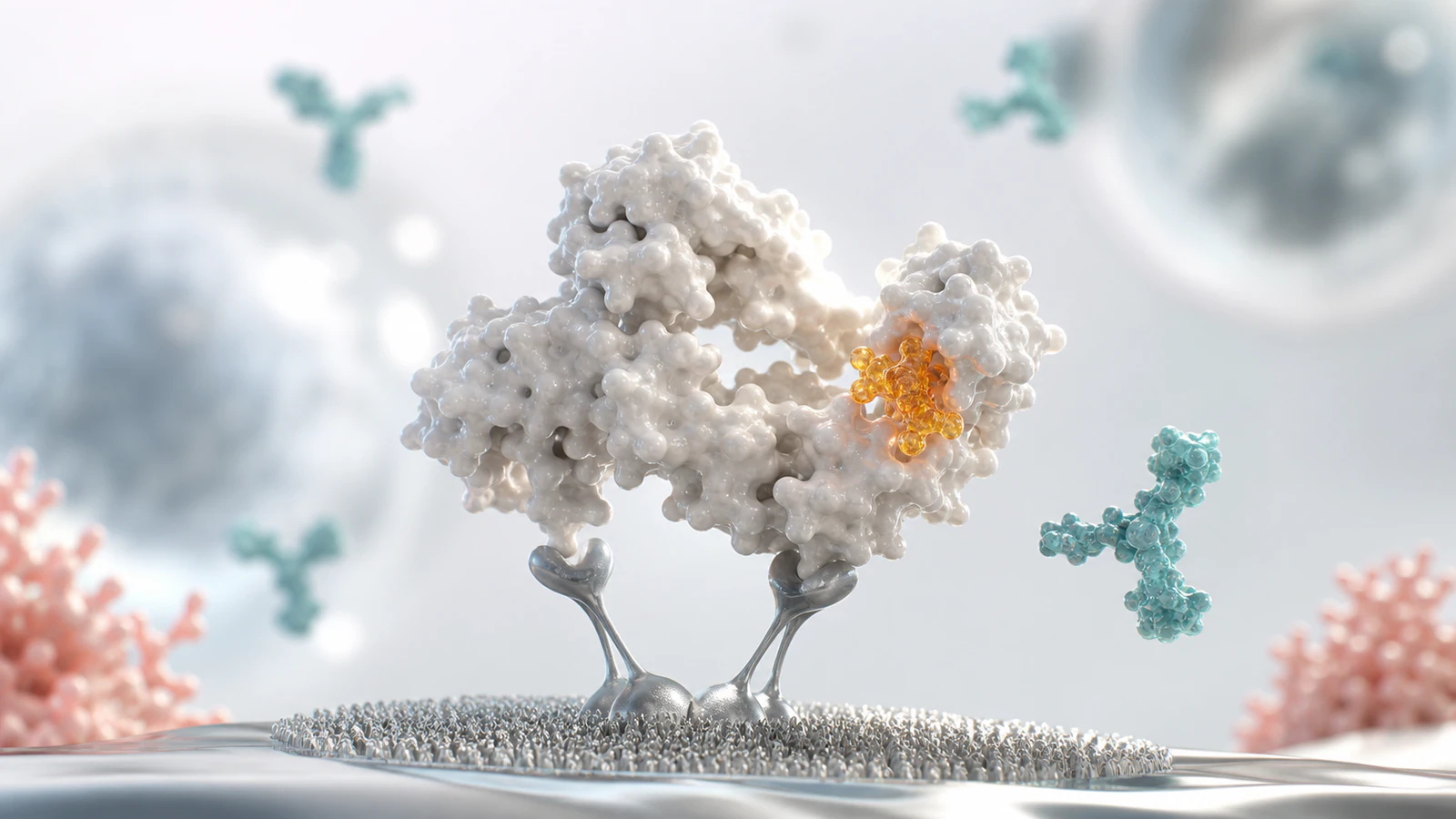
A strong bioanalytical assay visual starts with one practical question: what decision does this measurement support? A PK assay may support dose selection, exposure comparison or human translation. A PD assay may show target engagement or pathway modulation. An immunogenicity assay may help the team explain anti-drug antibody risk, neutralizing response or sample tiering. A biomarker assay may connect mechanism to patient selection.
That decision should drive the scene. The hero subject might be a therapeutic antibody in a serum-like environment, a receptor-ligand binding event, a labeled biomarker complex, an immune complex linked to ADA risk or a clean sample-to-signal workflow. Supporting forms should clarify the assay story without turning the image into a busy collage of tubes, charts and equipment.
The strongest visuals also respect the difference between measurement and claim. A render can show that a signal comes from target binding, capture chemistry or molecular detection, but the nearby copy should define what the data proves. That distinction helps scientific reviewers approve the asset and helps non-specialists understand why the assay matters.
- Define the program decision the assay supports.
- Show one central analyte, biomarker or molecular interaction.
- Use supporting forms only to clarify capture, detection, signal or biological context.
- Keep the visual plausible enough for bioanalytical, clinical and regulatory reviewers.
- Connect the scene to dose, exposure, target engagement, safety or patient selection.
Core Scenes For Bioanalytical Assay Animation
Bioanalytical assay animation works best when it is built as a short evidence path. The opening scene defines the biological or clinical sample context. The next scene isolates the analyte or biomarker of interest. The third scene shows capture, detection or quantification logic. The final scene links the measured signal back to the decision the buyer cares about.
This sequence is especially useful for complex modalities. Therapeutic proteins, bispecifics, ADCs, RNA medicines, cell therapies, viral vectors and nanoparticles can each require different assay logic. A consistent visual system lets the team explain exposure, activity and immune response without rebuilding the story from scratch for every deck.
| Scene | Hero Subject | Scientific Meaning | Commercial Use |
|---|---|---|---|
| Sample context | Serum, plasma, tissue fluid or cellular microenvironment | Shows where the analyte is measured | Clinical deck, platform overview, diligence package |
| Analyte recognition | Therapeutic molecule, biomarker, ADA complex or receptor target | Clarifies what the assay detects | Website section, assay explanation, partner education |
| Capture and signal | Binding pair, labeled reagent, enzymatic or MS-informed readout | Explains how measurement becomes evidence | Scientific figure, conference asset, technical animation |
| Decision link | Exposure, target engagement, immune response or patient segment | Connects assay evidence to program value | Investor slide, BD deck, clinical strategy narrative |
How To Show PK PD Without Making A Chart
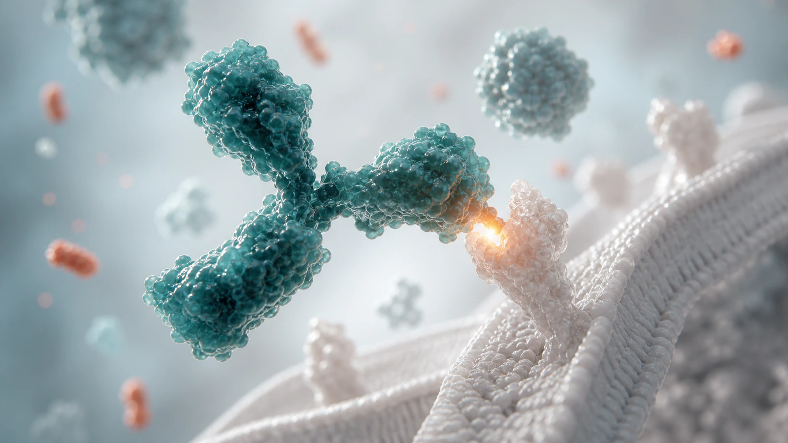
PK and PD evidence often ends up as a line plot, but the buyer usually needs the mechanism behind the plot. A bioanalytical render can show the therapeutic molecule in a clean plasma-like environment, a receptor or soluble target that defines measurable engagement and a restrained signal cue that suggests quantification without adding fake axes or labels.
For PK, the scene can focus on concentration, clearance, tissue distribution or sample timing. For PD, it can show a biomarker complex, pathway marker or cellular response that links exposure to biological effect. The point is not to replace validated graphs. The point is to create a visual explanation that makes the graph easier to interpret when the viewer reaches it.
This matters when a team is preparing for fundraising, partnering or clinical education. A polished PK PD visualization can help a program lead explain why the selected dose is plausible, why a biomarker is meaningful or why a translational assay package reduces uncertainty. It gives the data a shape before the viewer is asked to parse the numbers.
- Use molecular concentration, binding and tissue context as visual anchors.
- Avoid fake graph overlays, labels or UI elements inside the render.
- Pair the render with real study data in the surrounding deck or webpage.
- Show enough context for non-specialists without overstating clinical certainty.
Immunogenicity And ADA Visuals Need Scientific Restraint
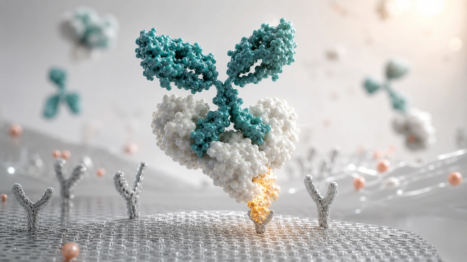
Immunogenicity assay visualization is valuable because anti-drug antibody risk can be commercially important and scientifically hard to explain. A good visual can show a therapeutic protein, an ADA-like binding complex and a tiered testing logic in a way that feels clear rather than alarmist. It should avoid theatrical immune attack imagery unless that is truly the approved message.
For therapeutic proteins, gene therapies and complex biologics, immunogenicity visuals can support internal education, patient-facing simplification, investigator materials, BD conversations and regulatory-adjacent communication. The strongest version usually separates three ideas: binding ADA detection, neutralizing potential and clinical interpretation. Each idea can have its own clean scene rather than one overloaded diagram.
The same restraint applies to biomarker and safety assays. Bioanalytical assay visualization services should make uncertainty easier to discuss, not hide it. When Animiotics designs these assets, the target is a reviewer-friendly visual system that looks premium while making the evidence boundaries easy to preserve.
Where Bioanalytical Visuals Create Business Value
Bioanalytical visuals create buyer intent because they sit close to program risk. If a team cannot explain exposure, target engagement, immunogenicity or biomarker evidence, the platform may look less mature than it is. If those same assay stories are clear, the company can show that its science is measurable, translatable and ready for serious review.
The assets can be used across a biotech website, investor deck, partnering package, clinical update, scientific poster, conference booth or internal training module. A single hero render can introduce the assay system, while supporting images can explain PK PD linkage, ADA logic and biomarker evidence. For teams also investing in analytical characterization visualization services, bioanalytical visuals extend the story from product quality into in vivo and clinical meaning.
The production value matters. Generic icons or flat assay cartoons often make a serious program look early. Premium Blender or Maya quality scientific renders can signal that the company understands the molecule, the evidence and the buyer conversation. That does not replace data, but it helps the data get understood.
- Fundraising decks that need to connect assay evidence to program maturity.
- Partnering packages that need clear PK, PD and immunogenicity narratives.
- Clinical updates that need biomarker and exposure logic explained quickly.
- Websites that need to show platform credibility without exposing confidential details.
- Conference visuals that let technical and commercial teams tell one story.
What To Include In A Bioanalytical Visual Brief
A focused brief saves time and protects scientific accuracy. Start with the assay type, the analyte, the audience and the decision the visual must support. Then define what can be shown publicly, what must remain abstract and what claims require review. If the asset is for a regulated or investor-facing context, separate approved claims from internal assumptions before production begins.
Useful inputs include assay purpose, modality, sample type, high-level method, detection principle, key biomarker or analyte, acceptable abstraction level, color constraints, existing slide language and example visuals the team wants to avoid. For PK PD and immunogenicity work, it is also helpful to identify whether the story is exploratory, validated, clinical-stage or already published.
The deliverable can be scoped as a single website hero, a set of blog or deck images, a scientific animation, a figure package or a reusable 3D assay visual system. If the team will reuse the story across multiple programs, building a modular system usually provides more value than a one-off image.
- Assay type and biological sample context.
- Analyte, biomarker, therapeutic molecule or immune complex.
- Audience such as BD, investors, clinicians, scientists or patients.
- Decision supported by the assay evidence.
- Approved claims, sensitive details and required review boundaries.
- Required formats such as website image, deck render, animation or figure system.
FAQ: Bioanalytical Assay Visualization Services
What are bioanalytical assay visualization services?
They are scientific rendering, animation and figure services that explain how assays measure therapeutic exposure, pharmacodynamic response, immunogenicity, biomarkers or translational evidence. The work can support biotech, pharma, CRO, platform and research communication.
Which assays can be visualized?
Common examples include ligand binding assays, PK assays, PD biomarker assays, immunogenicity and ADA workflows, neutralizing antibody concepts, mass spectrometry-informed bioanalysis and translational biomarker panels. The visual style should be adapted to the claim and audience.
Can these visuals be accurate without showing confidential assay details?
Yes. A careful render can abstract reagent identities, concentrations, proprietary platform steps or exact sample handling while still explaining the measurement logic. The key is to agree on what must remain generic and what the team can defend publicly.
How many images does a team usually need?
Many teams can start with one cover render and three supporting scenes: sample-to-signal, PK PD linkage and immunogenicity or biomarker interpretation. Larger programs may need a reusable visual system for multiple assays, modalities and audiences.
CTA: Make Assay Evidence Buyer-Ready
If your assay package is central to program confidence, it should not be trapped in dense methods slides. Animiotics can turn PK, PD, immunogenicity, biomarker and translational assay evidence into premium scientific renders or animations that help biotech, pharma and research teams explain why the data matters.
Use bioanalytical assay visualization services when you need a clear website hero, investor slide, partnering asset, clinical education visual, conference image or scientific figure system that makes measurement logic commercially useful.