Why AlphaFold 3 Complex Visualization Matters
AlphaFold 3 complex visualization matters because the prediction is only the start. Once you have a protein bound to a ligand, a protein associated with DNA or a protein engaging RNA you still need a figure that makes the interaction obvious to a human reader. Reviewers, collaborators, investors and internal program teams do not make decisions from raw coordinates alone. They respond to a clear visual story that shows what binds where, what confidence looks acceptable and which biological question the model helps answer.
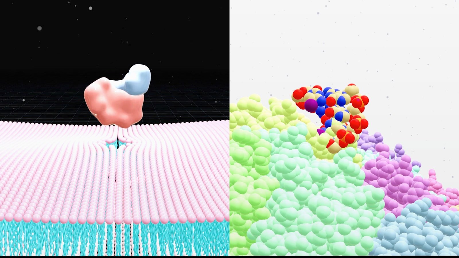
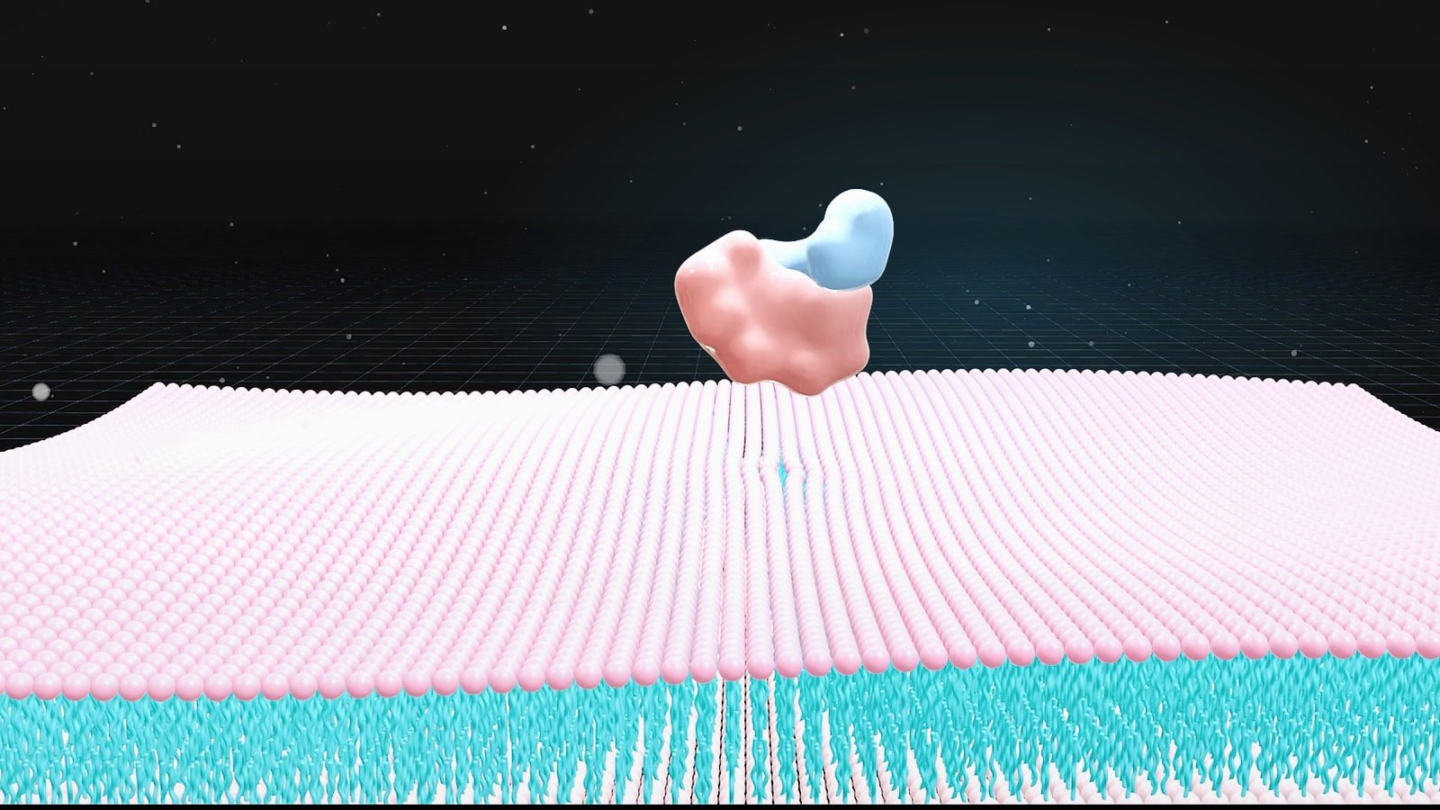
That is why the primary challenge is not just alphafold 3 visualization. It is translation. AlphaFold 3 can predict biomolecular interactions across proteins, nucleic acids, ligands, ions and some modified components. Yet many outputs are still difficult to read in default viewers because the scene is crowded, chain identity is unclear and the most relevant contact region is buried in a full atom model. Good alphafold 3 complex visualization removes that friction.
A practical workflow starts with a simple question: what should the viewer understand in five seconds? For a protein ligand complex visualization the answer may be the pose and pocket context. For protein DNA complex visualization it may be sequence-specific recognition on the major groove. For protein RNA complex visualization it may be interface geometry or domain rearrangement. Once that outcome is defined the structure can be simplified, colored, labeled and framed around the message instead of the raw output.
- Use the full model for validation but a simplified scene for communication.
- Define one key takeaway before you choose colors, camera angle or labels.
- Treat AlphaFold output as a hypothesis that needs confidence-aware visual framing.
What AlphaFold 3 Changes for Visual Workflows

The original AlphaFold wave changed how scientists think about single protein structure prediction. AlphaFold 3 expands that visual landscape because it targets biomolecular interactions rather than isolated folds alone. The 2024 Nature paper describes a model that predicts structures involving proteins with ligands, DNA, RNA and other biomolecules. In practice that means your visual workflow has to handle mixed molecular types more often and communicate cross-molecule relationships clearly.
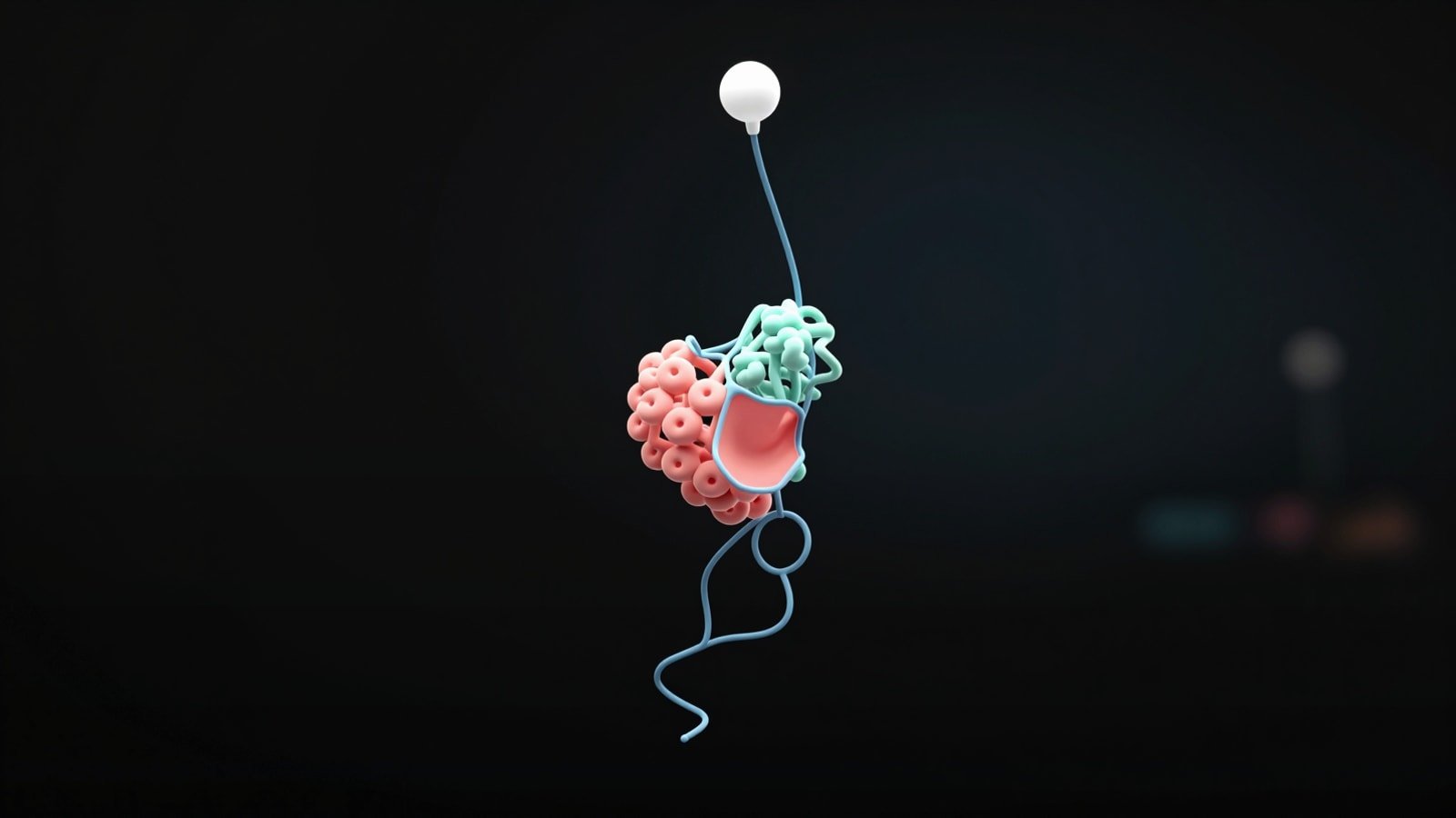
This shift has an immediate consequence for figure design. Older structure figures often focused on one chain with a ribbon and surface overlay. AlphaFold 3 outputs often need a layered composition: protein cartoon for fold context, sticks for interface residues, surface for pocket boundaries and a separate treatment for DNA, RNA or small molecules. If every component gets the same visual weight the figure becomes noisy. If you underplay the non-protein partner the whole point of the complex is lost.
The DeepMind AlphaFold materials also note an important operational detail. AlphaFold 3 is available through the AlphaFold Server for non-commercial use with a more limited set of ligands and covalent modifications than the full inference pipeline. That means the alphafold server complex viewer is often the fastest route for early exploration while local workflows remain useful when you need more control over rendering, asset export or downstream presentation work.
For teams building publication graphics or motion assets this is where visual production becomes strategic. A viewer screenshot may be enough for a quick internal check. It is rarely enough for a paper figure, a conference slide or a persuasive mechanism story. If you need examples of how structure gets turned into a stronger narrative, see PDB to Animation and Protein Ligand Interaction Visualization.
- AlphaFold 3 increases the number of mixed biomolecule scenes you need to explain.
- Viewer convenience and publication clarity are not the same deliverable.
- Server outputs are useful for exploration but polished communication usually needs a second visualization pass.
How To Approach Protein Ligand DNA and RNA Complexes Differently
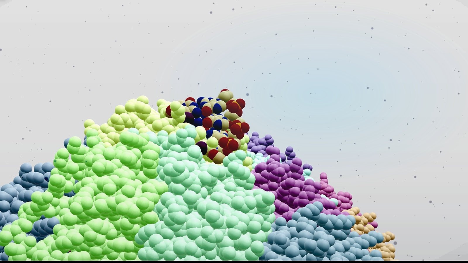
A strong alphafold 3 complex visualization workflow adapts to the biology. Protein ligand complex visualization is usually pocket-centric. The reader wants to see the ligand orientation, nearby side chains, hydrogen bond logic and whether the binding site is buried, open or allosteric. In that setting the best view often combines a semi-transparent protein surface with key residues in sticks and the ligand in a high-contrast color. Remove distant loops unless they explain selectivity or access.
Protein DNA complex visualization needs different priorities. Here the message often depends on path, symmetry, stoichiometry and sequence-facing surfaces. DNA should usually remain visually continuous so the viewer can see groove engagement, bending or wrapping. Proteins can be simplified into domains or subunits with consistent color coding. If the scene includes multiple chains, label only the units that advance the story. Too many chain labels make the image feel technical instead of informative.
Protein RNA complex visualization benefits from showing both architecture and local contacts. RNA often has shape-driven recognition features such as stems, loops, bulges or duplex segments that matter as much as residue-level contacts. If you crop too tightly you lose structural context. If you stay too wide the binding motif disappears. The answer is a two-panel logic inside one figure: an overview view for placement and a zoomed view for interface detail.
Across all three use cases confidence-aware styling helps. Where uncertainty is high use softer saturation, lighter opacity or a secondary note in the caption instead of presenting the whole model as equally certain. That keeps the visual honest while still making the prediction useful.
- Ligand scenes are usually pocket-first.
- DNA scenes are usually path and orientation first.
- RNA scenes often need both global fold context and local interface detail.
| Complex type | Primary visual focus | Best first view |
|---|---|---|
| Protein-ligand | Pocket geometry and contact residues | Surface plus ligand sticks |
| Protein-DNA | Binding path and domain placement | Wide view with DNA continuity |
| Protein-RNA | Fold context plus motif contacts | Overview and zoom pairing |
Using The AlphaFold Server Complex Viewer Without Getting Stuck In Default Views
The alphafold server complex viewer is valuable because it lowers the barrier to first inspection. You can load a prediction quickly, inspect chain arrangement and confirm whether the broad interaction hypothesis looks plausible. That speed is useful early in a project when the goal is triage rather than publication polish. The problem starts when teams mistake that first-pass view for a finished communication asset.
Default views rarely answer the actual scientific question. They often show too much of the model, center the wrong region and use generic coloring that does not distinguish functional roles. A productive workflow is to use the server viewer for orientation then export the structure to a dedicated visualization environment for controlled styling. Think of the server as the place to verify what exists and your design tool as the place to explain why it matters.
In practice that means checking chain identity, interface location and obvious clashes or unrealistic placements first. After that decide the story unit. Are you explaining a predicted ligand pose for medicinal chemistry? A protein DNA interface for transcriptional control? An RNA recognition mode for target engagement? Once the story unit is chosen you can build a scene around it instead of dragging the whole prediction into every figure.
This same principle applies to other scientific visuals. The fastest output is not usually the clearest output. If your team is also building broader publication assets beyond structure views, AI Scientific Figure Generator and How to Create a 3D Graphical Abstract for Nature and Cell show how to move from raw scientific content to presentation-ready design.
- Use the server viewer for screening and orientation.
- Rebuild the final scene in a toolchain that gives you full control over color, cropping, labels and export.
- Never assume the default camera angle is the biologically meaningful one.
A Practical Step By Step Workflow For AlphaFold 3 Visualization
Step one is model triage. Open the prediction and identify the interacting components, the likely interface and the confidence pattern. If the model contains multiple plausible contact regions decide which one maps to your research question. Step two is scene reduction. Hide everything that does not help the reader understand the claim. Secondary chains, solvent-like clutter, distant termini and unused conformers usually weaken the image.
Step three is hierarchy. Assign a clear visual rank to each molecular class. Proteins usually carry fold context as ribbons or surfaces. Ligands often deserve the strongest contrast because they are small and easy to miss. DNA and RNA need shape continuity so viewers can read trajectory and orientation. Step four is annotation. Add only the labels that resolve ambiguity such as chain names, pocket residues, binding motif names or domain IDs.
Step five is narrative output. One static image is rarely enough for complex interactions. Build a matched set: overview figure, interface close-up and if needed a short motion clip or turntable. That combination works especially well when you need to explain mechanism rather than just structure. For teams expanding beyond stills, The Rise of the Video Abstract shows why motion can increase comprehension for dense scientific stories.
Step six is review. Ask someone outside the immediate project to describe the figure back to you in one sentence. If they cannot identify the binding partner, the contact region or the biological significance quickly the visualization still needs work. Clear structural communication is testable. If comprehension is slow the scene is not finished.
- Triage the model before you style it.
- Reduce the scene before you annotate it.
- Build visual hierarchy before you polish exports.
- Validate comprehension with a non-expert viewer inside your team.
Common Mistakes In AlphaFold 3 Complex Visualization
The most common mistake is showing everything. Scientists often feel that removing parts of the model makes the image less rigorous. The opposite is usually true. A cluttered figure hides the important evidence and makes the communication weaker. Selective visibility is not manipulation when it is honest, consistent and aligned with the question being answered.
Another mistake is using one rendering style for every molecule. Protein ribbons, nucleic acid backbones and ligands do not carry information the same way. If they all appear as identical sticks or identical surfaces the reader has to work too hard. Visual differentiation should reflect biological role. That is especially important in protein ligand complex visualization where the ligand can disappear against a busy protein surface.
A third mistake is ignoring uncertainty. AlphaFold 3 predictions can be extremely useful but they are still predictions. If a loop placement or peripheral chain orientation is weakly supported the figure should not imply equal certainty across the whole assembly. Use captions, confidence overlays or restrained styling to signal that difference. This builds trust rather than reducing impact.
The final mistake is stopping at the structure figure when the real need is a broader communication package. If the audience needs mechanism, pathway context or translational significance you may need a graphical abstract or animation layer on top of the structural image. That is where integrated visual storytelling becomes much more effective than isolated snapshots.
- Do not confuse completeness with clarity.
- Do not use uniform rendering for biologically different components.
- Do not hide uncertainty when it affects interpretation.
- Do not assume a single screenshot can carry a full scientific story.
FAQ
Researchers usually ask the same few questions when they start working with AlphaFold 3 complex outputs. The answers below are short on purpose so they can guide decisions quickly.
What is the difference between alphafold 3 visualization and alphafold 3 complex visualization?
AThe first can refer to any AlphaFold 3 output. The second is specifically about showing interactions between multiple biomolecules in a way that makes the interface understandable.
Is the alphafold server complex viewer enough for publication figures?
AUsually no. It is strong for first inspection and useful for quick internal review but polished figures normally need custom styling, cropping, annotation and export outside the default viewer.
How should I present a protein ligand complex visualization?
AStart with a pocket-centered scene, highlight the ligand strongly, show only the residues that explain binding and keep the rest of the protein simplified for context.
How should I present a protein dna complex visualization?
APreserve DNA continuity, make domain placement readable and choose a camera angle that makes groove engagement or wrapping obvious.
How should I present a protein rna complex visualization?
APair a global overview with a tighter interface view so the reader can understand both RNA architecture and local recognition.
Should I treat AlphaFold 3 predictions as confirmed experimental structures?
ANo. Treat them as high-value structural hypotheses and communicate confidence explicitly.
CTA
If your team has AlphaFold 3 outputs but still needs figures, 3D scenes or animations that explain the biology clearly, Animiotics can help turn raw predictions into communication assets built for papers, fundraising, business development and scientific storytelling.
We design custom visuals for protein ligand complex visualization, protein dna complex visualization, protein rna complex visualization and broader mechanism narratives. If you need a clearer way to show what your model predicts and why it matters, visit Animiotics.